ⓘ Images in this post are AI-generated virtual design concepts intended for inspiration. Linked products reflect the style and feel of the space, but are not exact matches. This post contains affiliate links. As an Amazon Associate, I may earn on qualifying purchases.
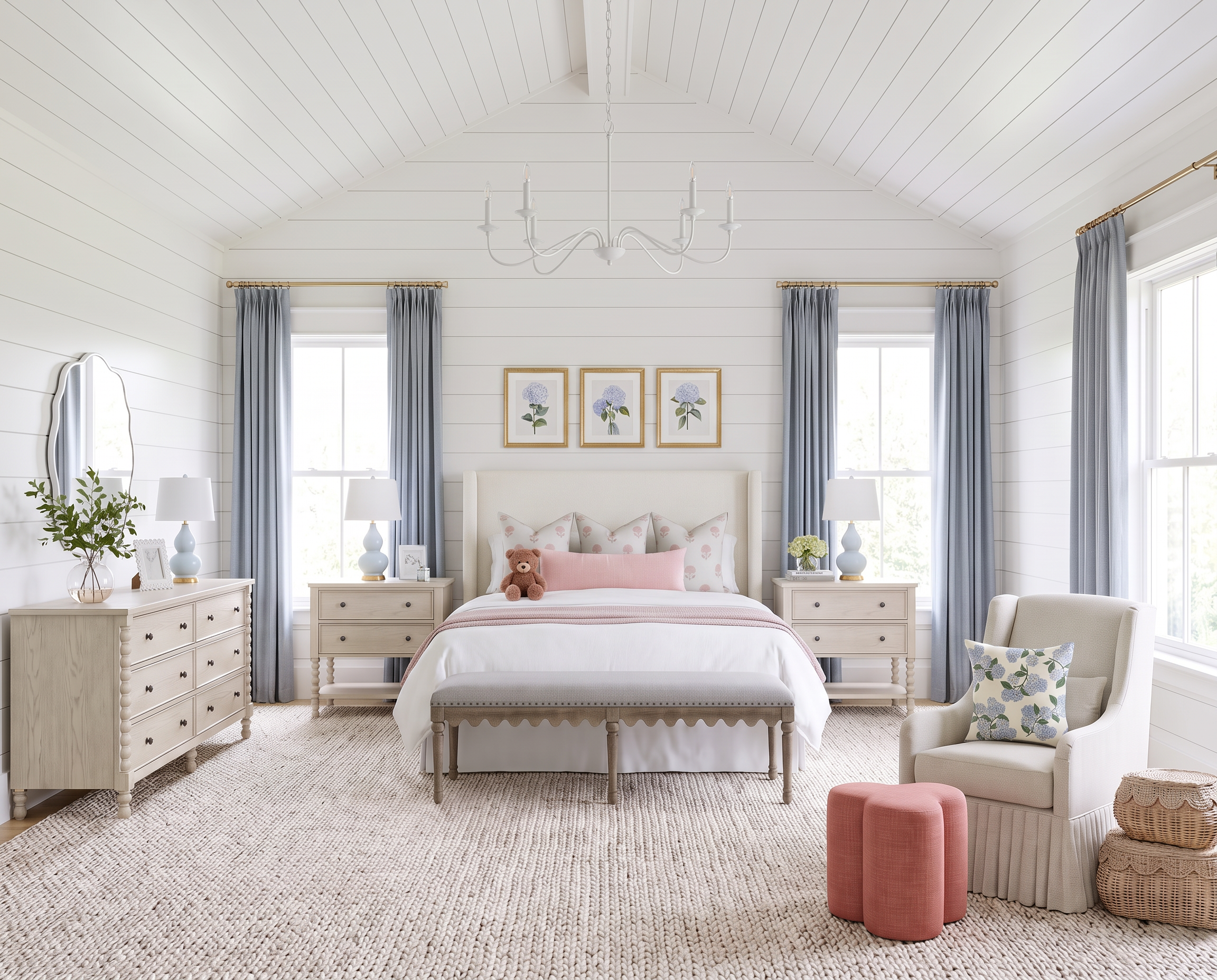
There’s something about blush and blue together that just works in a girls room.
It gives you plenty of softness and color without making the whole room feel overwhelmingly pink—or like you’ll need to completely redo it a few years from now.
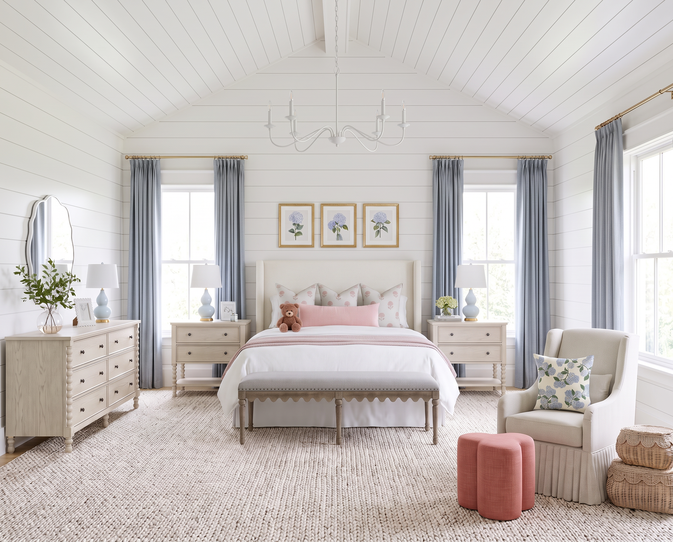
For this room, I started with soft blue and cream, brought in smaller touches of blush, and layered in light wood, woven texture, and a little brass. It feels feminine and sweet, but the foundation is classic enough to grow right along with her.

The prettiest kids rooms don’t have to rely on a theme.
I’d much rather build a kids room around a color palette than a theme. It gives you so much more flexibility as they get older—and saves you from having to redo the entire room when whatever they were obsessed with six months ago is suddenly completely unacceptable.
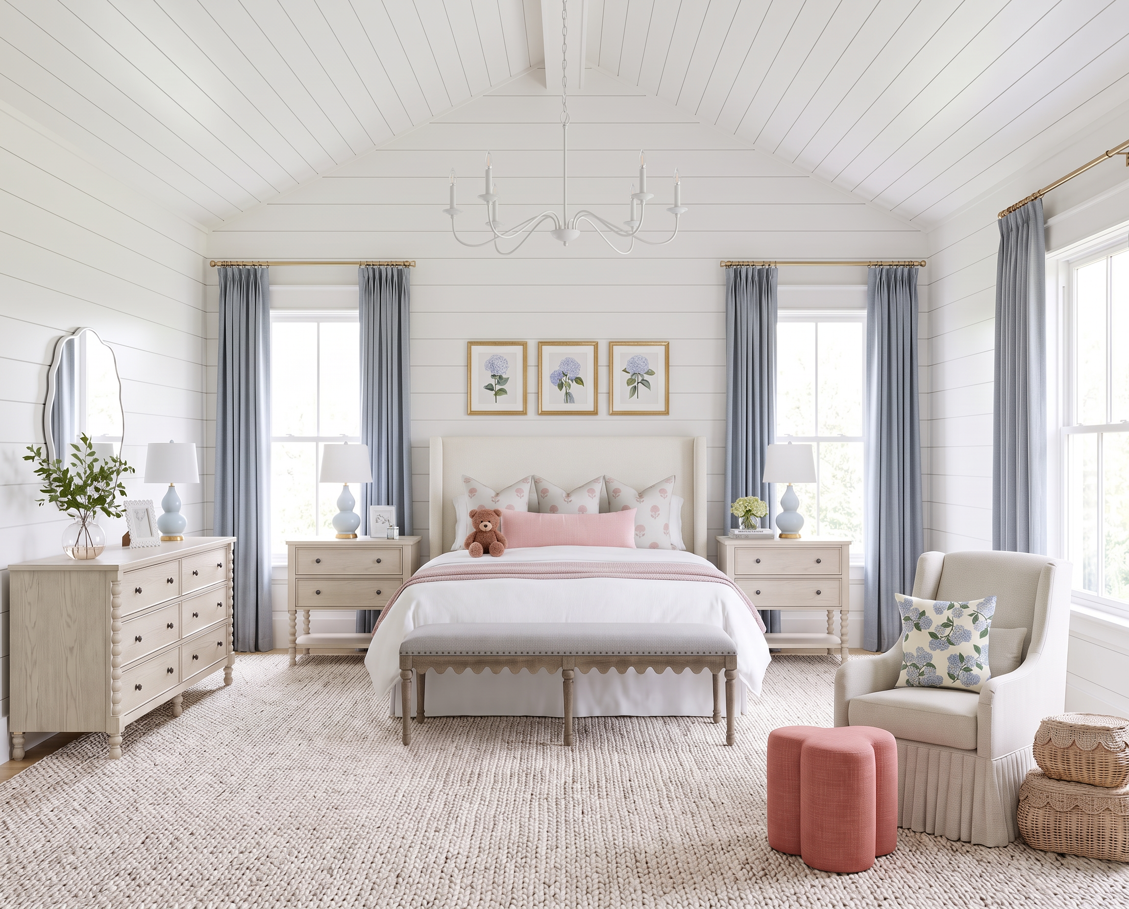
The upholstered bed gives this room a soft foundation, while the light wood nightstands and dresser keep all that blue and blush from becoming too sweet. I’ve linked similar spindle-style nightstands and a coordinating dresser from Wayfair to recreate that mix.
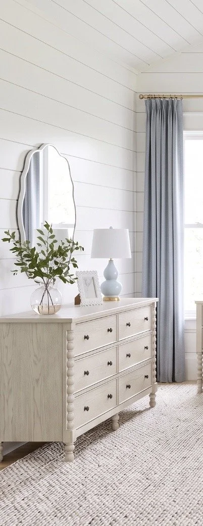
I especially love the pop of color from the blue lamps. They repeat the blue from the bed and pillows without making every piece in the room match. I’ve linked a similar blue lamp I love from Shades of Light.
Overhead, the simple white chandelier keeps things light and airy and lets some of the smaller details have more personality. I’ve linked a similar six-light chandelier from Wayfair.
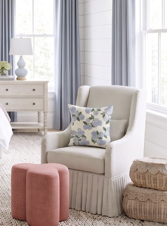
And then there’s the blush. Rather than making one of the major pieces pink, I like bringing it in through accents that could easily change later. I’ve linked similar blush Clover stools from Amazon, along with a similar neutral Merced glider from Pottery Barn Kids for a cozy little reading spot.
Pattern is much easier to mix when you keep the palette fairly tight.
There are several patterns happening in this room, but they all stay within the same soft palette of blue, blush, cream, and green. That’s what keeps the combination interesting without making the room feel busy.
The pillows are an easy place to do this. I love the mix of blue-and-green botanicals with the smaller blush pattern and simple pink lumbar pillow. I’ve linked similar blue-and-green hydrangea pillow covers from Amazon, a similar blush patterned pillow from Jillien Harbor, and a similar blush lumbar cover from Amazon.
I’ve also linked my favorite Amazon pillow inserts. I generally size the insert about two inches larger than the cover—a 22-inch insert inside a 20-inch cover, for example. It gives the pillow a much fuller, more finished look.
The woven baskets introduce another texture and, more importantly, give you somewhere to hide all the little things that somehow multiply in a kids room. I’ve linked a similar set of scalloped woven baskets from Amazon.
At the windows, the blue-gray drapery gives the room another layer of color without introducing more pattern. I’ve linked similar panels from TWOPAGES. I’d hang them high and wide so the fabric frames the windows rather than covering them—it’s one of the easiest ways to make a room feel taller and more finished.
The little details can change while the foundation stays.
This is probably my favorite thing about designing kids spaces. If the larger pieces are classic enough to stay, all the personality can come from things that are much easier to change.
The scalloped mirror is a perfect example. Its shape adds a little whimsy without feeling particularly young. I’ve linked a similar scalloped mirror from Pottery Barn Teen.
The same goes for the artwork. Simple gold frames let you change what’s inside them over the years without replacing the frames themselves. I’ve linked a similar matted gold frame from Target.
I also love using hydrangeas to carry the color palette into the accessories. I’ve linked similar faux white hydrangeas from Amazon, which give you the look without requiring anyone to remember that there are flowers in a child's bedroom that need water.
The neutral rug keeps the floor quiet while adding texture, and I’ve linked a similar woven rug from Pottery Barn Kids. At the foot of the bed, the upholstered bench adds another soft layer without introducing another strong color or pattern. I’ve linked a similar Levingston bench from Birch Lane.
That’s really the idea behind the entire room: let the foundation do the long-term work and let the smaller pieces have the fun.
The blush pillows can change. The artwork can change. The baskets can move somewhere else. Even the accent color can eventually become something completely different.
But starting with classic furniture, a soft blue-and-white foundation, and pieces that aren't tied to one particular age gives the room plenty of room to grow right along with her.
You May Also Like…


Love classic home design?
Get one beautifully designed newsletter each month featuring:
New virtual room designs
Designer styling tips
Curated collections
Exclusive decorating inspiration