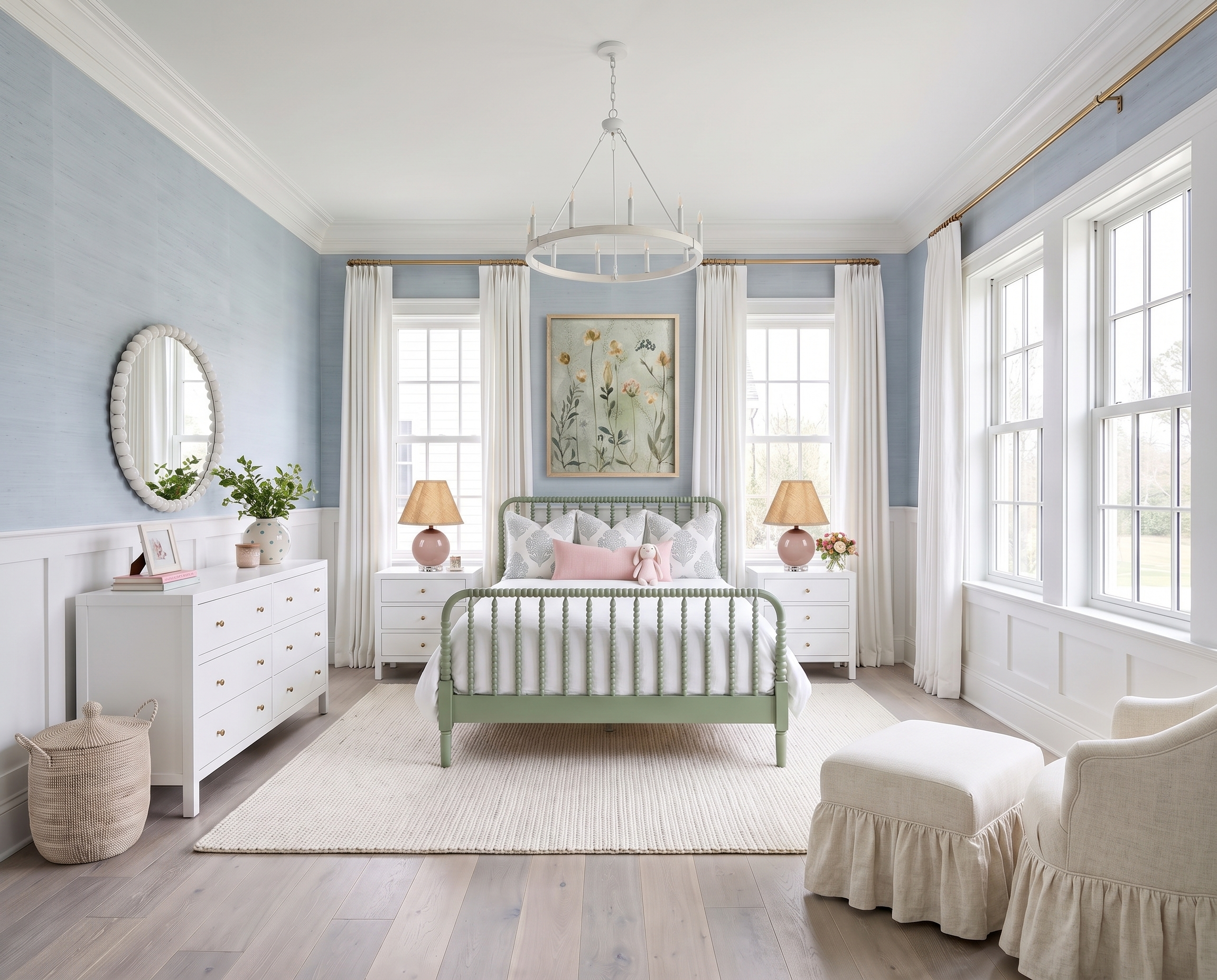
ⓘ Images in this post are AI-generated virtual design concepts intended for inspiration. Linked products reflect the style and feel of the space, but are not exact matches. This post contains affiliate links. As an Amazon Associate, I may earn on qualifying purchases.
Blue gets plenty of attention around here, but this room is a pretty good argument for letting green into the mix.
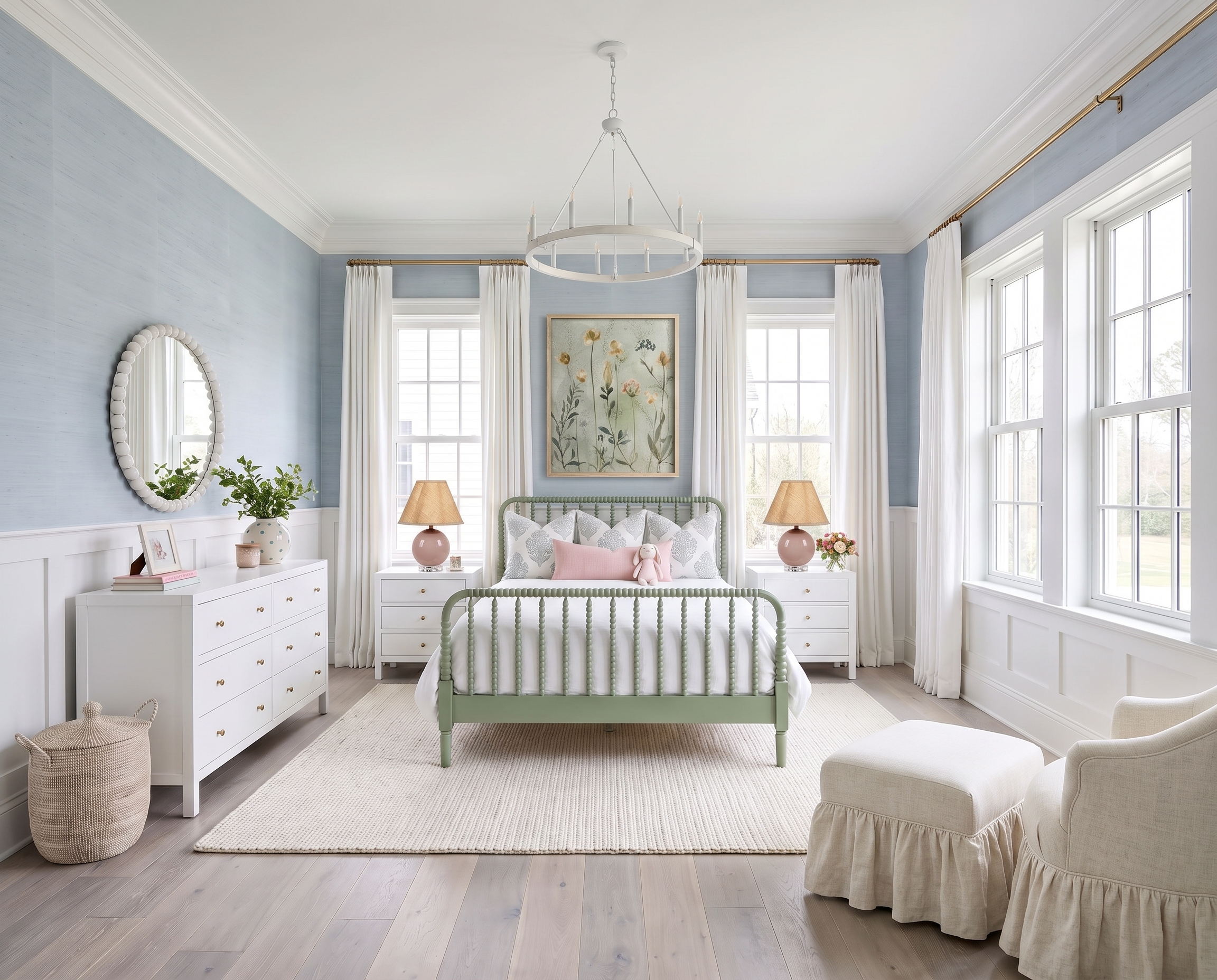
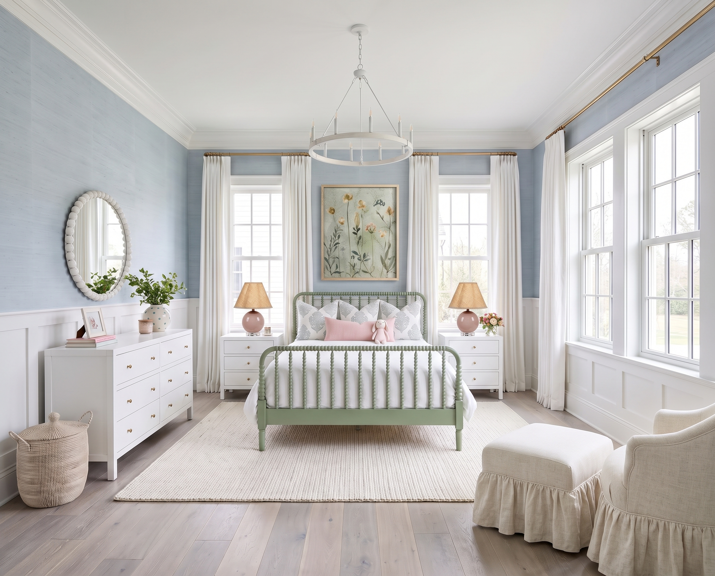
I started with a soft blue backdrop and plenty of white, then brought in that sage green spindle bed as the unexpected piece. Add blue-and-white floral drapery, a little blush, woven texture, and simple white furniture, and the whole room feels colorful without feeling busy. It’s soft and cheerful, but still classic enough that I wouldn’t get tired of it five minutes from now.

If everything coordinates perfectly, I usually want to mess it up a little.
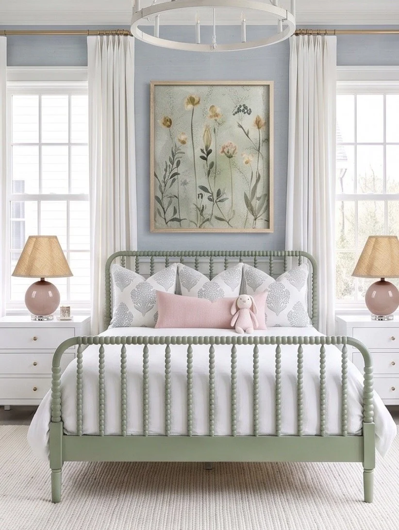
The sage green bed is what keeps this from becoming another entirely blue-and-white bedroom.
I’ve linked the similar Birch Lane Louisa Bed, which has that same spindle detail and muted green finish. Against the blue walls, it stands out just enough without becoming overwhelmingly colorful.
The bedding is intentionally much quieter. I’d keep the larger pieces white and bring the blue back in with patterned pillows. I’ve linked the Jillien Harbor pillow covers from Amazon for a similar soft blue pattern, then the Target So Soft Linen Rose Pillow for that tiny hit of blush in front.
That little bit of pink might seem unnecessary, but I think it does a lot. Without it, the room could start feeling very blue-green-white. One unexpected accent makes the palette feel much more collected.
Soft color works best when the bigger pieces stay simple.
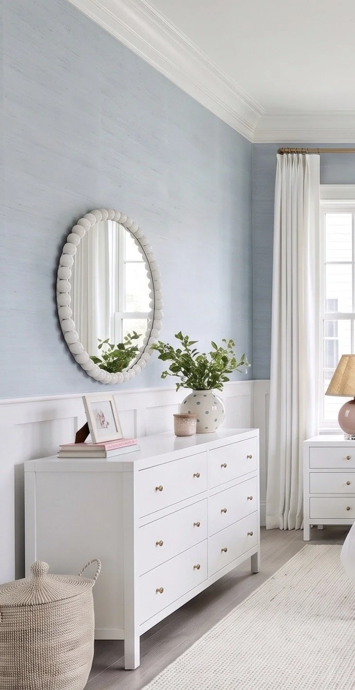
The walls add texture rather than another competing pattern. I’ve linked the Scott Living blue grasscloth wallpaper from Lowe’s for a similar look. Using it above white millwork gives you plenty of color while the lower half of the walls keeps the room feeling bright.
Then I’d simplify the furniture.
I’ve linked similar Wayfair Celine nightstands and dresser in white. I like using very straightforward casegoods when the bed, walls, and drapery already have this much personality. Not every piece of furniture needs its own moment.
The same goes for the floor. The similar Pottery Barn Kids Custom Chunky Wool Rug adds warmth and texture without introducing another pattern. It’s also large enough to anchor the bed and surrounding furniture instead of looking like a little rug floating in the middle of a big bedroom.
The smaller details are where you can have a little fun.
Once the big pieces are established, I’d rather finish a room like this with interesting shapes and texture than introduce more color.
The similar Wayfair round bobbin-style mirror repeats the rounded detail of the spindle bed without matching it exactly, while the similar Serena & Lily La Jolla Basket brings in a natural woven texture that breaks up all the painted furniture.
I also love the softness of the ruffled chair and ottoman- I’ve linked a similar find I love there- this Target Ruffle Skirt Accent Chair and Ottoman. They make that corner feel comfortable and slightly playful, but because they're cream, they don't compete with everything happening around them.
For lighting, I’ve linked the Wayfair Jashlyn chandelier for a similar oversized white fixture and the Ballard Designs Linda Accent Lamp for the bedside tables. The blush lamp is especially good here because it quietly picks up that tiny pink pillow without making pink another major color in the room.
This is exactly why I like starting with a palette rather than trying to make every piece match. Blue, sage, white, blush, and natural texture all get to play a part—and the finished room feels much more interesting because of it.
You May Also Like…


Love classic home design?
Get one beautifully designed newsletter each month featuring:
New virtual room designs
Designer styling tips
Curated collections
Exclusive decorating inspiration