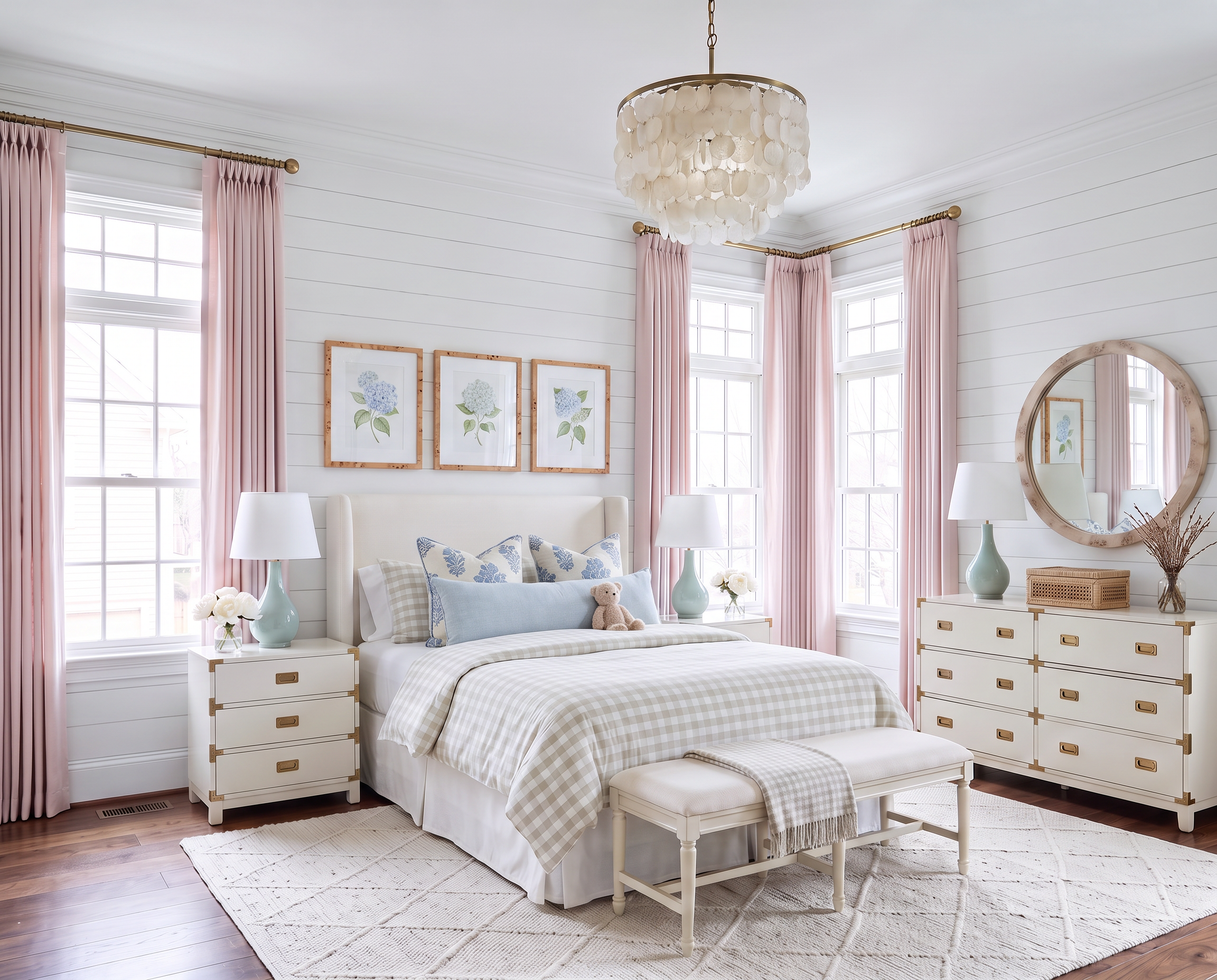
AI-generated design concept for inspiration. Linked products are similar, not exact matches. Affiliate links may be used; as an Amazon Associate, I earn from qualifying purchases.
If you want to use a color you love without asking the entire room to commit to it, drapery is one of my favorite places to start.
Here, it’s blush pink.
The curtains cover enough of the room to make the color feel intentional, but unlike wallpaper or painted furniture, they’re relatively easy to change if the room takes a completely different direction someday.
Add a little blue, a little green, warm wood, and natural texture, and the pink gets to be the fun part without becoming the entire room.

Drapery can carry a surprising amount of color.
The Pink Lemonade curtains are really what set the palette here.
I’ve linked a similar find here—the TWOPAGES Pinch-Pleat Drapes in Pink Lemonade.
I use TWOPAGES panels throughout my own home and love the tailored look you can get without going into true custom-drapery pricing.
This particular pink is also really easy to live with. It’s soft and warm without feeling overly sweet, and because it’s on fabric rather than something permanent, it gives the room plenty of personality without feeling like a huge commitment.
For the hardware, I’ve linked similar finds here:
Hang the rod close to the ceiling and extend it beyond the window frame whenever you have the wall space.
That lets the panels fall nearly floor to ceiling and gives the windows so much more presence.
For the larger furniture, I’d go in the opposite direction and keep things fairly quiet.
I’ve linked similar finds here:
Neither one feels particularly tied to a child’s bedroom, which is exactly what I want from the more expensive furniture.
Let the pieces you plan to keep for years be flexible. Then have more fun with the things that are easier—and considerably less painful—to change.
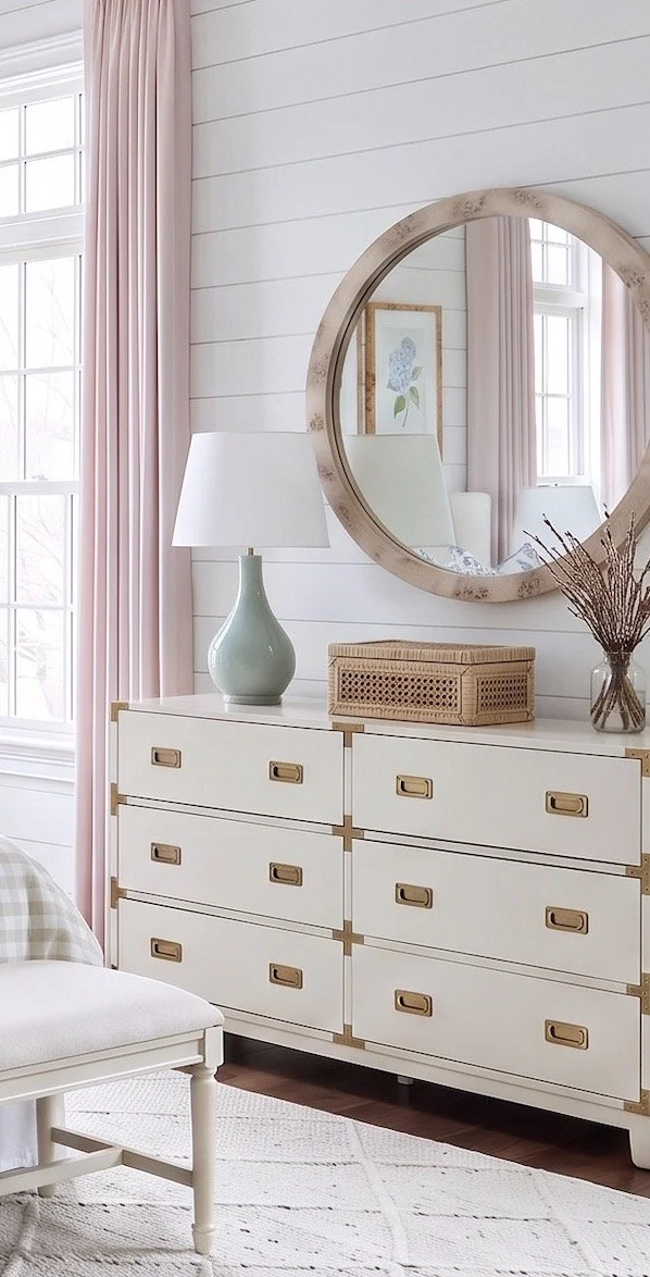
Pink gets even prettier when it isn’t the only color in the room.
The blue is subtle here, but I think it makes a big difference.
I’ve linked similar finds here:
I especially like pale blue with blush because it cools the pink down a little. You don’t need much of it either.
A pillow, a piece of artwork, and a few smaller details are enough to carry blue around the room without turning this into a blue-and-pink bedroom.
Then I’d add just a little green.
I’ve linked a similar find here—the Green Ceramic Table Lamps.
A matching pair gives the bedside area some symmetry, while the green adds another layer to the palette and keeps all of those softer colors from feeling too coordinated.
Overhead, I’ve linked a similar find here—the Gold Capiz Chandelier.
Capiz is especially pretty in a bedroom because it catches the light without feeling as formal as crystal. You get a little shimmer overhead, while the natural shell still feels soft and relaxed.
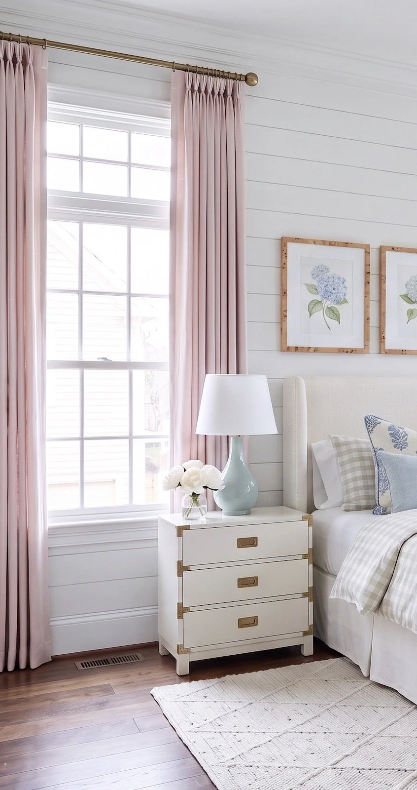
Natural texture is what grounds all of the softer color.
With blush, pale blue, green, and white already happening around the room, I wouldn’t add another major color.
I’d bring in warmer natural materials instead.
I’ve linked similar finds here:
The rattan boxes are useful for hiding all the little things that inevitably collect on a nightstand, while the burl frames and mirror introduce a richer wood tone against the lighter walls.
I especially like that contrast here.
Without those warmer materials, blush, pale blue, and white could start feeling a little too delicate. The burl wood, rattan, brass, and jute give the room some weight without making it darker.
The jute rug does the same thing underfoot.
There’s already enough color and pattern happening higher in the room, so the rug really doesn’t need to contribute more of either. Natural texture is plenty.
For the bed, I’ve also linked a similar find here—the Pillow Inserts I use and recommend.
I generally size the insert up about two inches. For a 20 × 20 cover, I’d use a 22 × 22 insert. It gives the pillow a fuller, more tailored shape and is probably one of the easiest little upgrades you can make.
That’s really why this bedroom works for me.
The Pink Lemonade drapery brings the personality, blue cools the palette down, green gives it a little contrast, and all of those warmer natural materials keep the softer colors grounded.
And underneath it all, the larger furniture stays simple.
So the room can feel wonderfully pink today without requiring everything in it to stay pink forever.
Love classic home design?
Get one beautifully designed newsletter each month featuring:
New virtual room designs
Designer styling tips
Curated collections
Exclusive decorating inspiration