AI-generated design concept for inspiration. Linked products are similar, not exact matches. Affiliate links may be used; as an Amazon Associate, I earn from qualifying purchases.
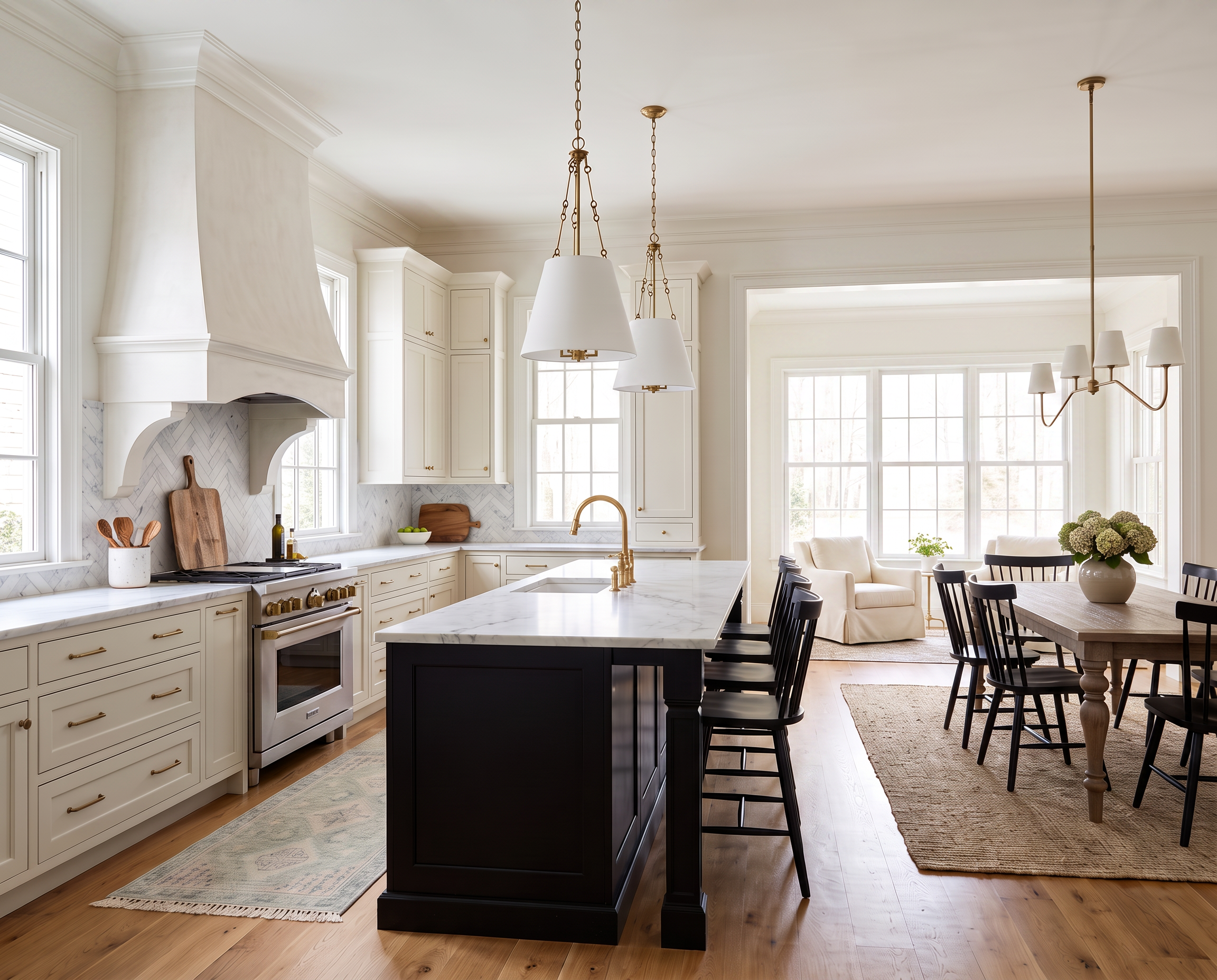
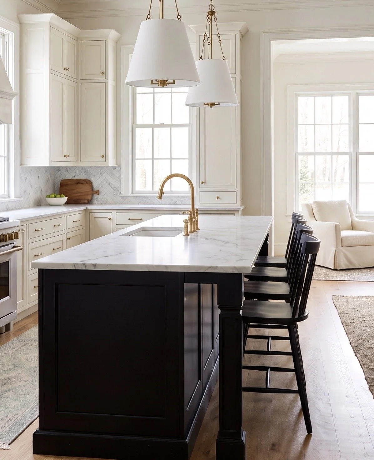
A black kitchen island is a commitment—but if you’re already renovating, I think it’s a pretty good place to make one.
The island sits right in the middle of the room, so giving it a darker finish creates an immediate focal point without making the entire kitchen feel dark.
Keep the perimeter cabinetry warm and light, then bring in plenty of natural wood, brass, and texture, and the black feels classic rather than stark.

A little contrast can completely change a white kitchen.
You really don’t need black everywhere for it to make an impact.
Using it on the island creates a strong focal point in the center of the room, while the lighter perimeter cabinetry keeps the kitchen feeling bright and open.
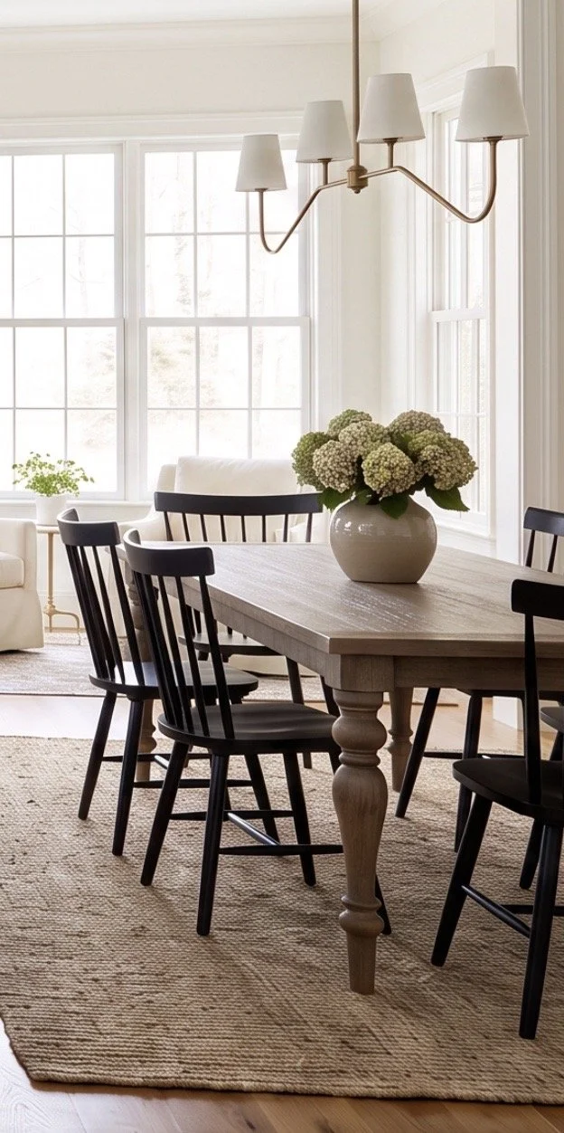
Then I’d start warming things back up with natural wood.
I’ve linked a similar find here—the Acacia Wood Dining Table.
The wood is important because black and white on their own can start feeling a little crisp. A warm dining table immediately softens that contrast and brings in some of the natural variation that makes a kitchen feel more relaxed.
From there, I’d repeat the black in just a couple of smaller places.
I’ve linked similar finds here:
Repeating the finish helps connect the kitchen and dining area without requiring everything to match.
The island establishes the contrast. The chairs and stools simply carry it through the room.
And if you love this look but already have a finished kitchen, you don’t necessarily need to paint the island to get it.
Start with the stools or dining chairs. Even lighting, hardware, or a runner can introduce enough contrast to change the feel of the room without touching the cabinetry.
Lighting can coordinate without coming as a matching set.
The brass lighting is one of my favorite parts of this kitchen because it warms up all of that black and white.
I’ve linked a similar find here—the Birch Lane Lodi Pendants.
I actually have these pendants in my own kitchen and love them. The warm brass is especially pretty against the black island, and the open shape gives you plenty of presence over the island without blocking the sightline through the room.
Over the dining table, I’ve linked a similar find here—the Joss & Main Lane Linear Chandelier.
I like that the two fixtures relate to each other without being identical.
They share that warm brass finish and have enough visual connection to make sense in the same space, but the kitchen doesn’t look like you bought a matching lighting collection.
That’s usually the balance I’m after.
I’d carry a little more brass onto the cabinetry too.
I’ve linked a similar find here—the Brass Cabinet Knobs.
Hardware is a relatively small detail, but against both the black island and lighter cabinetry, that warmer finish makes a noticeable difference.
Texture is what keeps black and white from feeling too crisp.
This kitchen has plenty of hard surfaces already—cabinetry, stone, wood, and metal—so the softer and more natural layers really matter.
I’ve linked a similar find here—this Large Wood Serving Board.
Leaned against the backsplash, it adds warmth and texture while still being something you can actually pull down and use.
Underfoot, I’ve linked similar finds here:
The jute gives the larger area texture without introducing another strong pattern.
At the sink, I like something with a little more variation. A vintage-style runner adds softness and character, and the pattern is considerably more forgiving in one of the hardest-working spots in the kitchen.
At the windows, I’ve linked a similar find here—the TWOPAGES Liz Linen-Look Panels.
Hang them close to the ceiling and extend the rod beyond the window frame when you have the space. The extra height makes the room feel taller, while the linen softens all of those harder kitchen surfaces.
Then I’d stop.
I’ve linked a similar find here—the Real-Feel Green Hydrangeas.
One generous arrangement, a wood board, and the things you actually use every day are plenty for the countertops.
I like a kitchen to feel decorated, but I also want enough empty counter space to cook without relocating half the room first.
That’s really why this kitchen works.
The black island gives it contrast, warm wood keeps that contrast from feeling stark, brass adds warmth, and jute, linen, and a vintage-style runner soften everything around it.
The island is definitely a statement—but everything surrounding it keeps that statement feeling classic rather than dramatic.
Love classic home design?
Get one beautifully designed newsletter each month featuring:
New virtual room designs
Designer styling tips
Curated collections
Exclusive decorating inspiration