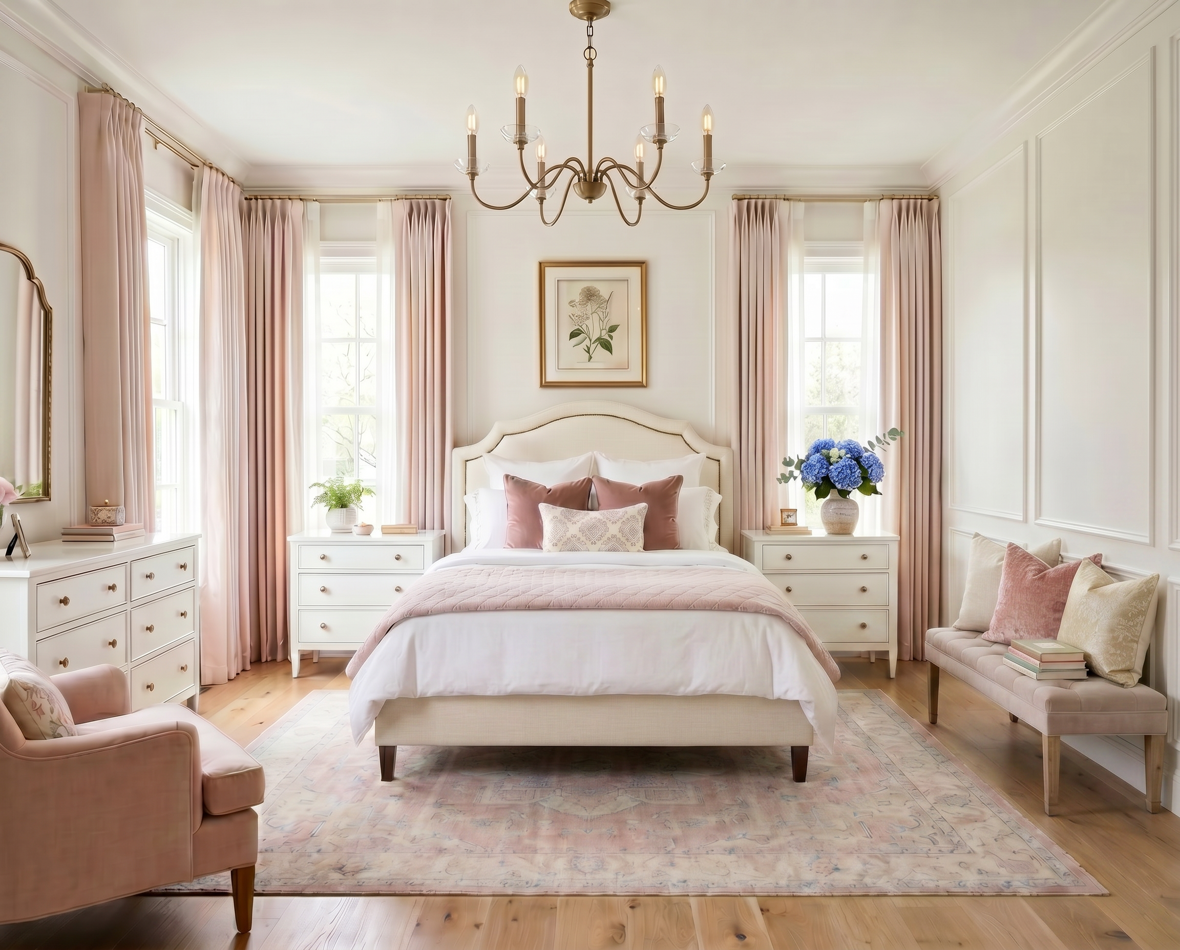
AI-generated design concept for inspiration. Linked products are similar, not exact matches. Affiliate links may be used; as an Amazon Associate, I earn from qualifying purchases.
I love a pink bedroom, but I don't necessarily want everything in the room announcing that it's a pink bedroom.
Here, the blush upholstered bed does most of the work. The arched shape softens all the straight lines you naturally get from windows, dressers, doors, and nightstands, while the color gives the room just enough personality.
I've linked a similar upholstered bed here. I especially like this shape because it feels pretty without being overly fussy—and it gives you plenty of room to take the rest of the bedroom in a more classic direction.
For the larger furniture, I wanted pieces that would quiet the pink down a little and give the room some warmth.
I've linked similar options for:
The warm wood dresser and nightstands balance all that blush and give the room a foundation that doesn't feel tied to a particular age or decorating phase.
Because, realistically, tastes change. The dresser doesn't need to.
I brought the pink back in with the chair. Normally I'm pretty careful about repeating a color in larger pieces, but I like it here. The bed and chair are far enough apart that the repetition makes the palette feel intentional rather than like we found one pink fabric and got carried away.


Blush gets a reputation for being a children's color, but I really think it comes down to what you put around it.
Pair it with lots of bright white and more pink, and yes—it can get sweet pretty quickly.
Pair it with warm wood, cream, faded pattern, brass, and a little blue, and it starts behaving almost like a neutral.
That's what the rug is doing here. The pattern has enough blush to connect with the bed and chair, but it's faded and subtle rather than another big block of pink.
Around the dresser, I kept the accessories warm and classic rather than adding more pink.
I've linked similar options for:
I like the curved mirror because it quietly repeats the arch of the headboard without making the room feel overly coordinated.
The botanical artwork brings in more of those warm wood tones, which I think this palette really needs. Without the wood, all the pink, cream, and pale blue could start feeling a little too delicate.
The natural frames give it some weight.

Once the larger pieces are in place, this is where I like to have a little more fun.
The bed doesn't need five different colors to feel layered. Keeping the pillows within the same general palette and changing up the pattern and texture gives you plenty of interest without making things busy.
I've linked similar options for:
For the inserts, I generally size up about two inches from the pillow cover—a 22-inch insert in a 20-inch cover, for example. It gives the pillow a fuller, more tailored shape and makes a surprisingly big difference.
At the windows, I kept things simple with linen drapery and warm brass hardware.
I've linked similar options for:
I use TWOPAGES drapery throughout my own home and really like the tailored look you can get without going into true custom-drapery pricing.
I'd take the rod close to the ceiling and let the panels fall all the way to the floor. It's one of those relatively simple details that can make the windows—and really the entire room—feel more finished.
A little blue is what keeps all this pink from becoming too much of a good thing.
The hydrangeas on the dresser are a small detail, but I love what that soft blue does against the blush.
I've linked similar faux real-feel blue hydrangeas here.
You don't need much blue. That one small moment is enough to cool the palette down and connect with the softer blue tones elsewhere in the room.
And that's really the formula here: let blush be the feature, then give it plenty of quieter things to live with.
Warm wood. Creamy neutrals. A little brass. Soft blue. Natural texture.
The room still feels decidedly pink—just not so pink that you're going to want to redo the whole thing the minute tastes change.


Love classic home design?
Get one beautifully designed newsletter each month featuring:
New virtual room designs
Designer styling tips
Curated collections
Exclusive decorating inspiration