AI-generated design concept for inspiration. Linked products are similar, not exact matches. Affiliate links may be used; as an Amazon Associate, I earn from qualifying purchases.
I love a white kitchen, but I don’t necessarily want it to feel white.
Give me warm wood, woven cane, linen, marble, aged brass, and just enough contrast to keep everything from blending together. You still get that bright, airy feeling that makes a white kitchen so appealing, but the room feels warm and lived in too.

A white kitchen really lives or dies by its texture.
When most of the room is one color, the materials have to do the interesting work.
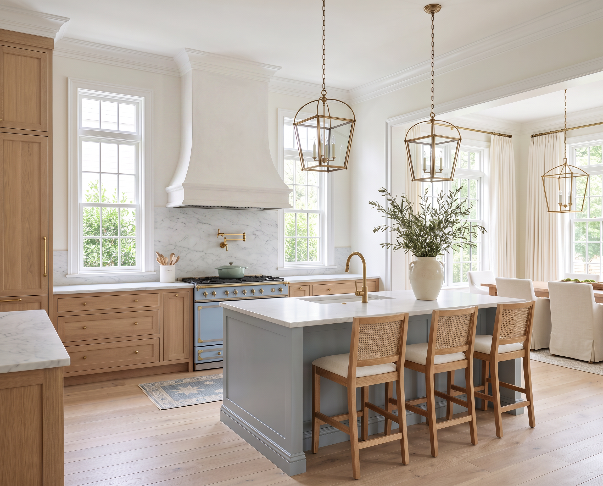
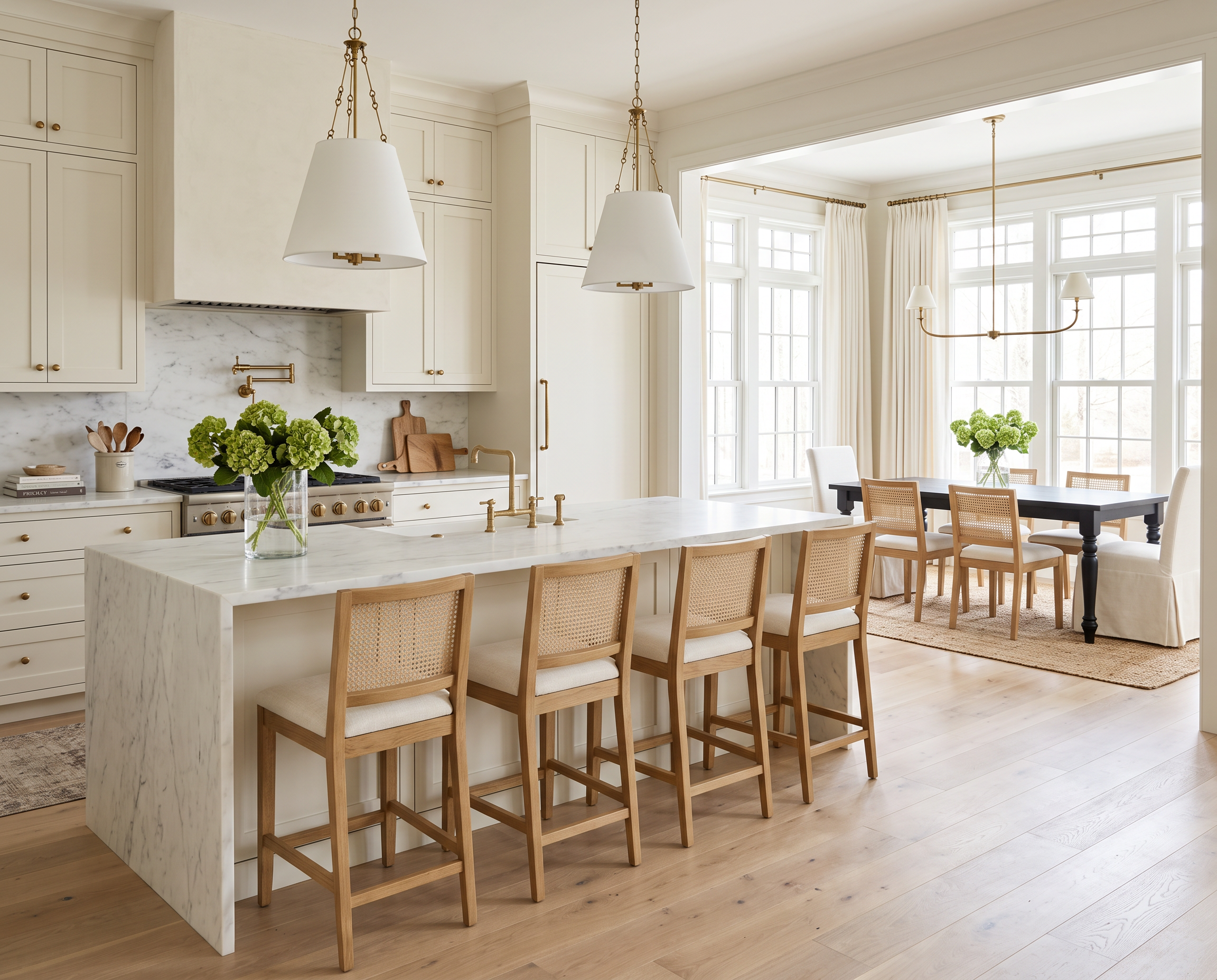
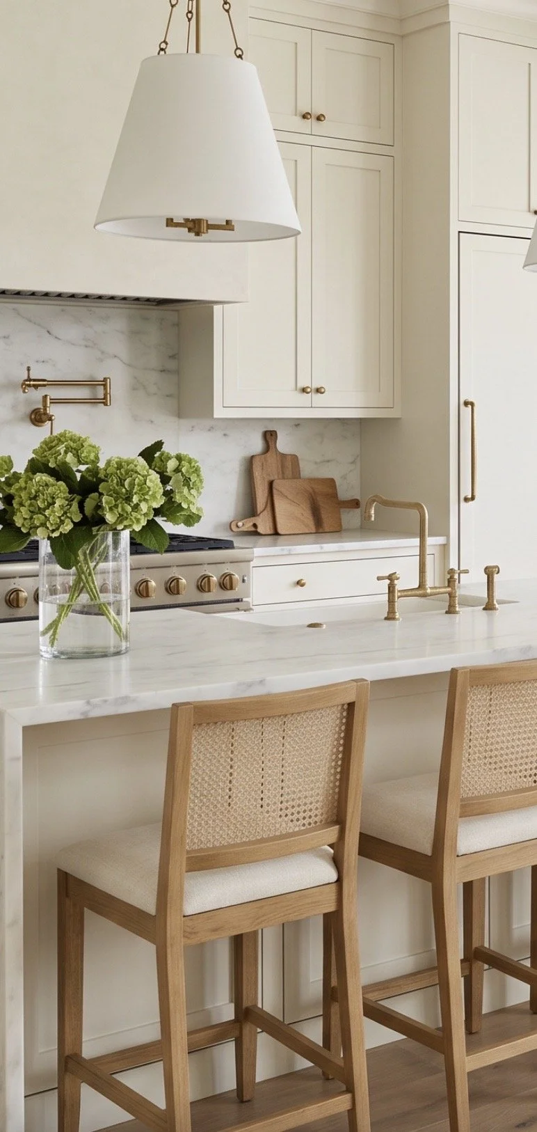
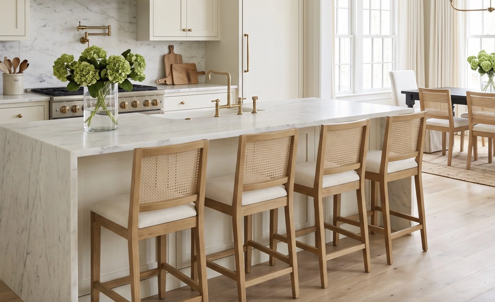
The cane counter stools are a big part of that here. I’ve linked similar Cane Counter Stools from Wayfair here.
I especially like cane-back stools at a large island because you can see through them. A row of six solid chair backs can become a whole lot of furniture very quickly, while woven cane keeps everything feeling lighter.
It also brings another natural material into the room without introducing another color.
The marble island can be the substantial piece. Everything around it gets to feel a little quieter.
And because counter stools are almost never all perfectly pushed in at the same time—at least not in my house—I’ll take all the visual lightness I can get.
Bright and airy doesn’t have to mean stark.
Some of my favorite white kitchens actually have very little true bright white in them.
They’re layered with warmer whites, cream, oak, natural fibers, brass, and stone. Those subtle differences are what give a neutral room depth and keep it from feeling flat.
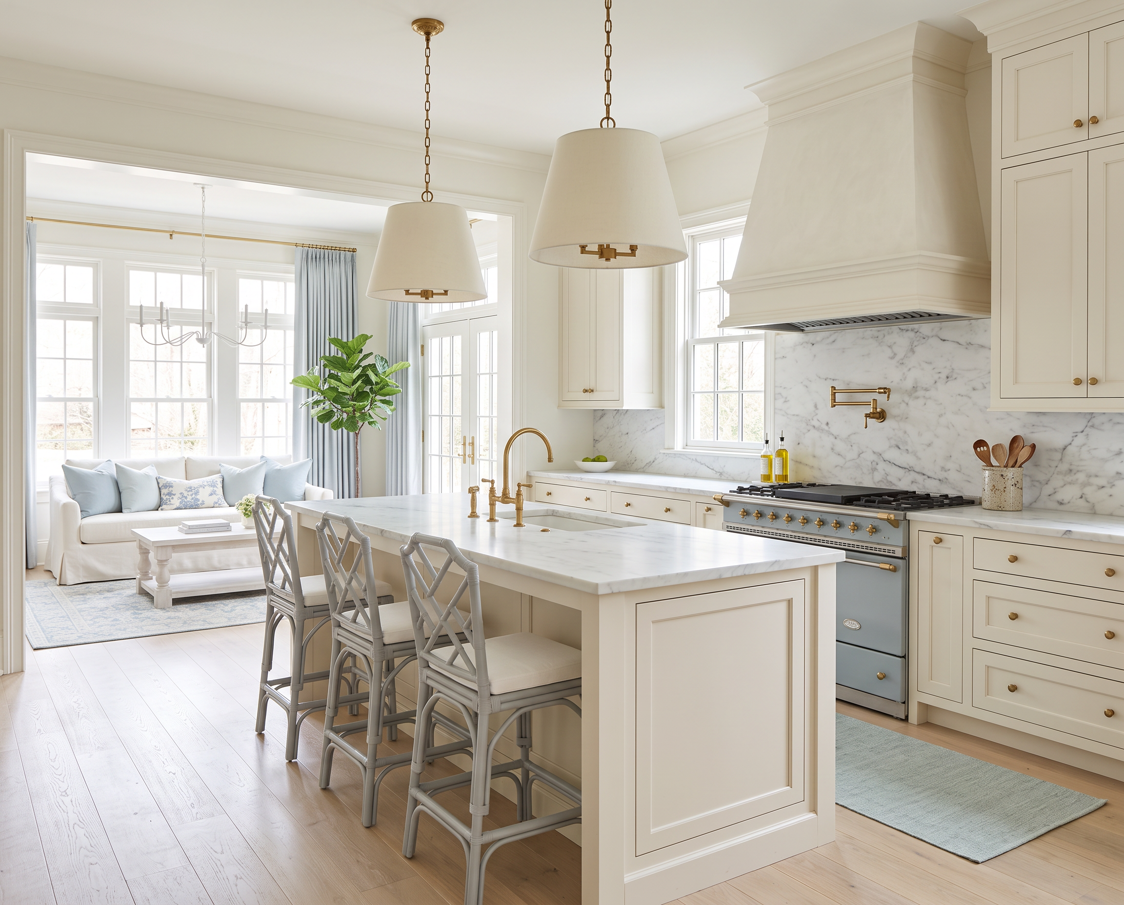
The linen pendants are a perfect example. I’ve linked a similar option here—the Birch Lane Lodi Linen Pendant.
I actually have these pendants in my own kitchen, and they’re still one of my favorite details.
The fabric shades soften all of the harder surfaces you naturally have in a kitchen—cabinetry, marble, metal, flooring—and bring in a little warmth overhead.
I also like that they don’t feel overly “kitchen.” They’re simply pretty light fixtures that happen to work beautifully over an island.
And if I can look at something in my own house every single day and still be happy I chose it, that’s usually a pretty good sign.
Adjoining rooms should feel connected, not like you bought everything as a set.
When a kitchen opens into a dining area, I like repeating a few materials or finishes rather than trying to make the two spaces match exactly.
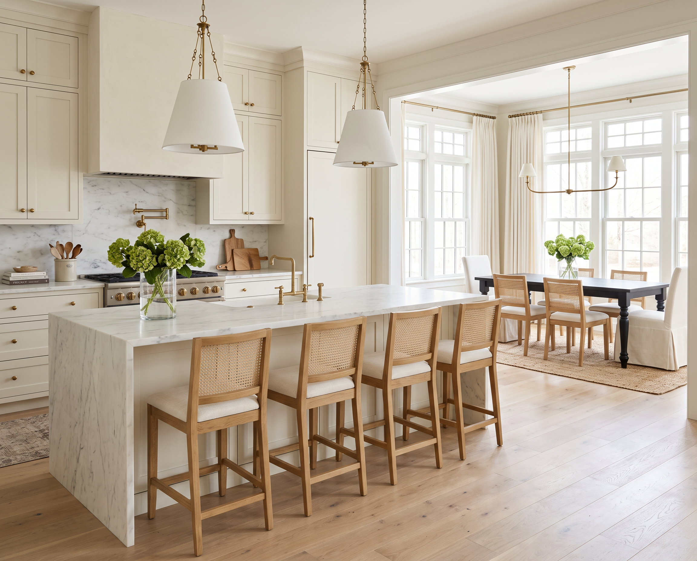
The brass linear chandelier in the dining area relates back to the kitchen lighting, but has a completely different shape. I’ve linked a similar option here—the Joss & Main Greta Linear Chandelier.
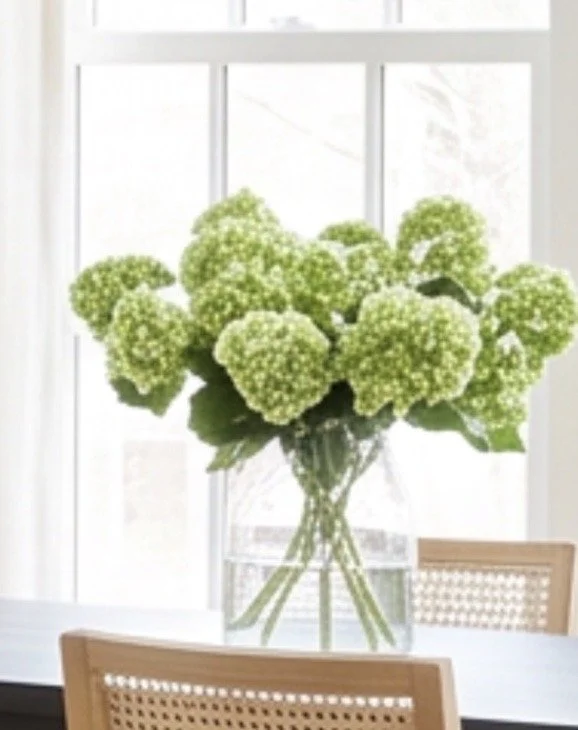
The furniture and textiles carry that same idea through the rest of the space. I’ve linked similar options for the dining pieces shown here:
The slipcovered chairs keep the dining area soft and relaxed. And if I’m going to put white fabric anywhere near actual meals, removable slipcovers are definitely the direction I’m going.
The vintage-style rug adds some pattern and warmth, while the darker dining table gives all of the pale finishes a little contrast.
I especially like that darker wood here. With so much white, cream, oak, and marble, your eye needs somewhere to land. Without it, the entire space could start floating away into one very large pale cloud.
That mix is really what makes the room work.
Smooth marble against woven cane. Linen beside brass. Warm oak with painted cabinetry. A darker wood table grounding everything.
The palette itself is incredibly simple, but the room doesn’t feel simple because the materials are doing all the work.
And that’s usually the trick with a white kitchen. You don’t necessarily need more color to make it interesting.
Sometimes you just need more texture.
Love classic home design?
Get one beautifully designed newsletter each month featuring:
New virtual room designs
Designer styling tips
Curated collections
Exclusive decorating inspiration