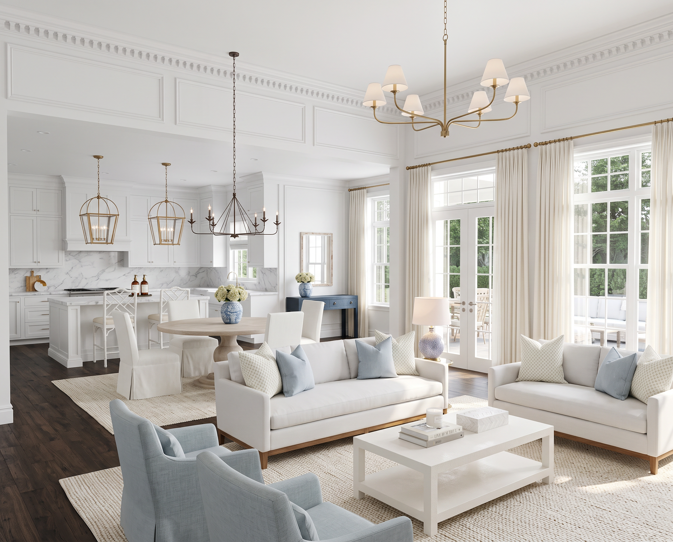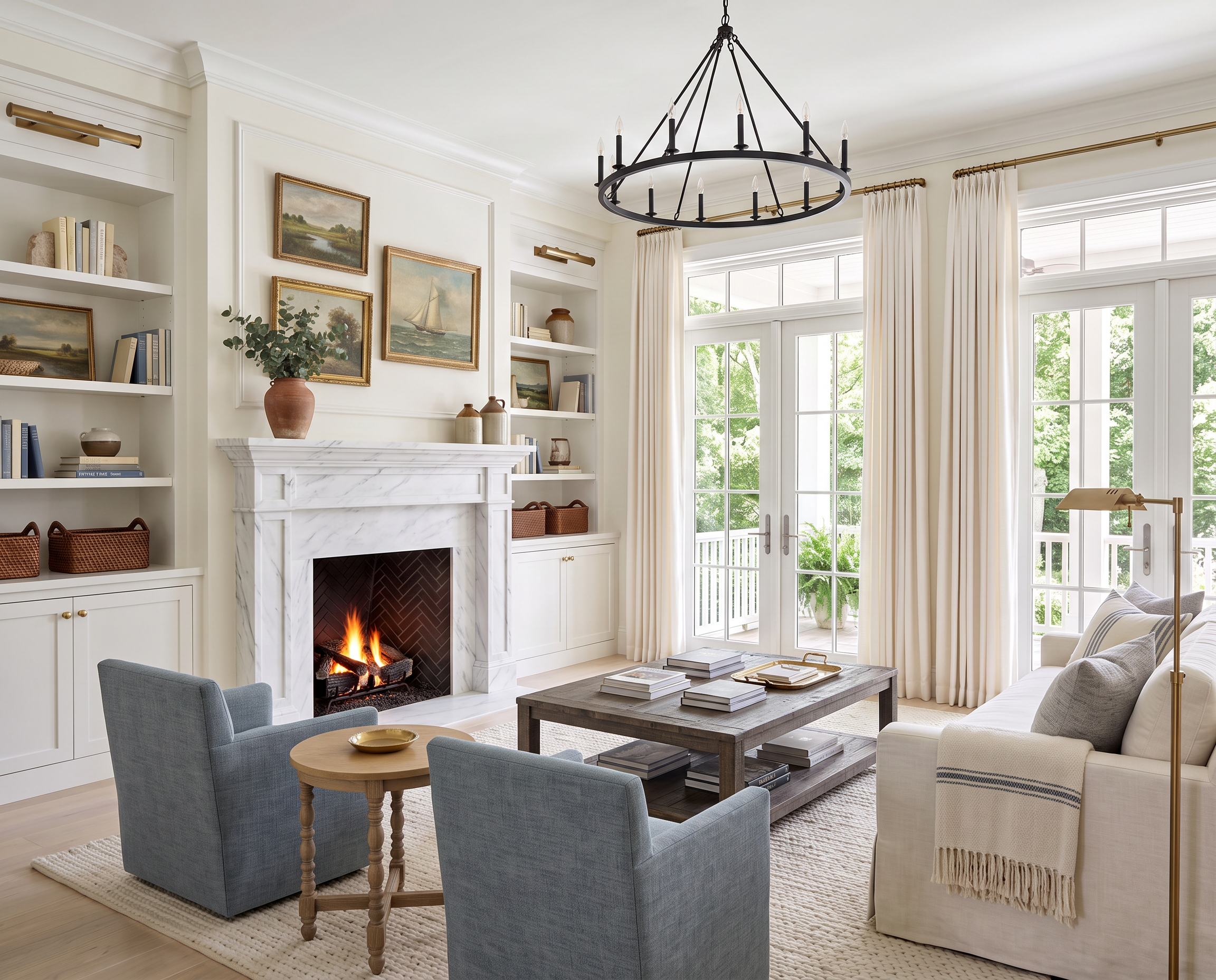
AI-generated design concept for inspiration. Linked products are similar, not exact matches. Affiliate links may be used; as an Amazon Associate, I earn from qualifying purchases.
There are several different wood tones in this room, and not one of them matches perfectly.
That’s actually one of my favorite things about it.
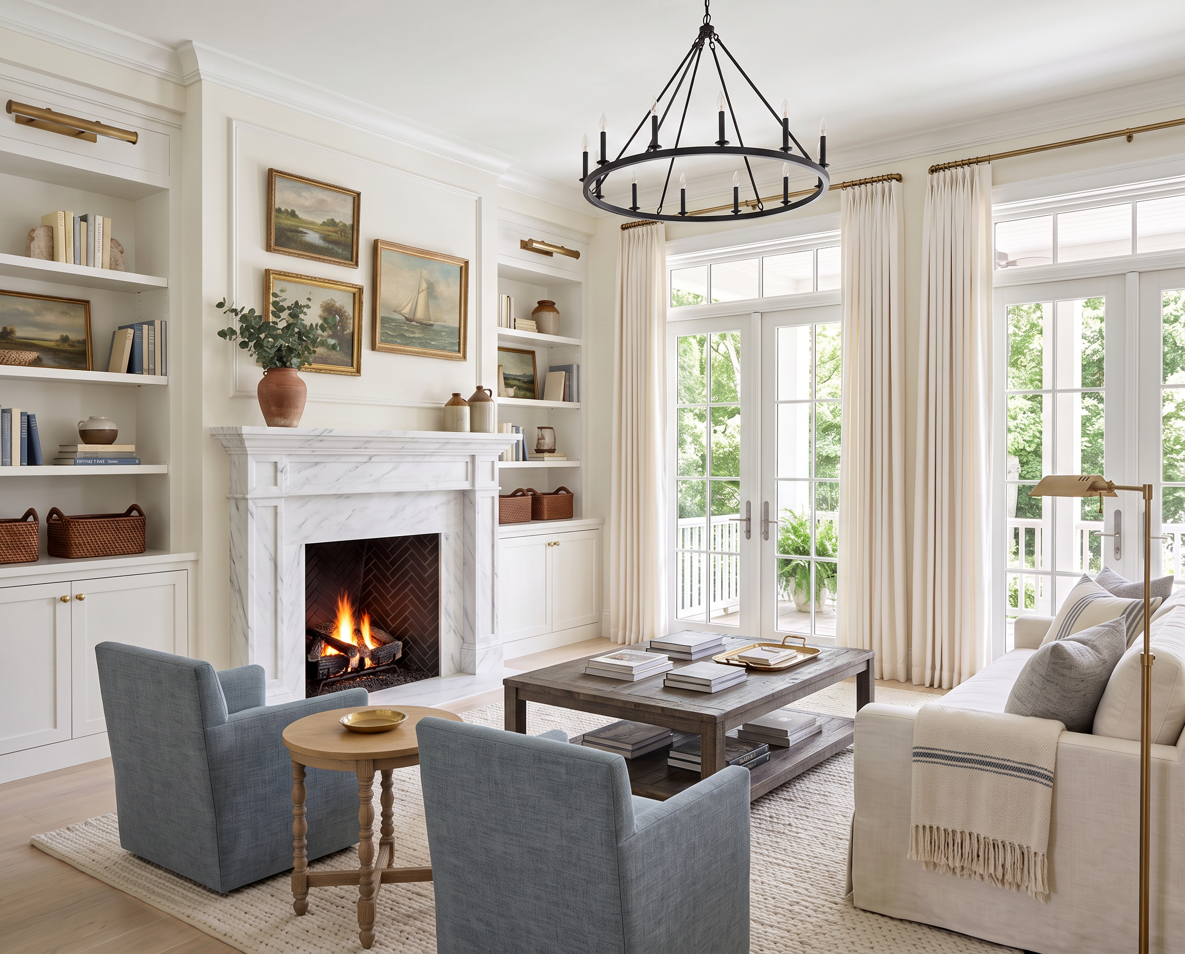
Warm wood floors, a darker turned-leg side table, a rustic coffee table, soft white upholstery, and little touches of blue give the room that collected feeling that’s hard to get when everything comes from the same furniture set.

Your wood tones really don't have to match.
I think this is one of those decorating rules a lot of us absorbed somewhere along the way: pick a wood finish and stick with it.
But rooms are usually much more interesting when the wood tones complement each other instead.
Here, the darker side table sits right alongside a warmer, more rustic coffee table, and neither one perfectly matches the floors. I’ve linked a Dark Wood Side Table and Solid-Wood Coffee Table here to recreate the mix.
The trick is making the differences look intentional.
I actually prefer wood finishes that are noticeably different rather than two that are almost—but not quite—the same. That little bit of contrast makes the room feel collected over time instead of like you tried to match everything and missed by half a shade.
Keeping the larger upholstered pieces light helps too.
I’ve linked:
The creamy sofa gives all of those wood tones a quiet backdrop, while the soft blue chair brings in just enough color.
And I really do love that swivel chair. It’s beautiful and such a good value for the price.
The whole combination feels relaxed because nothing is trying too hard to coordinate—which, conveniently, also means you don't have to carry a wood sample around every time you buy a table.
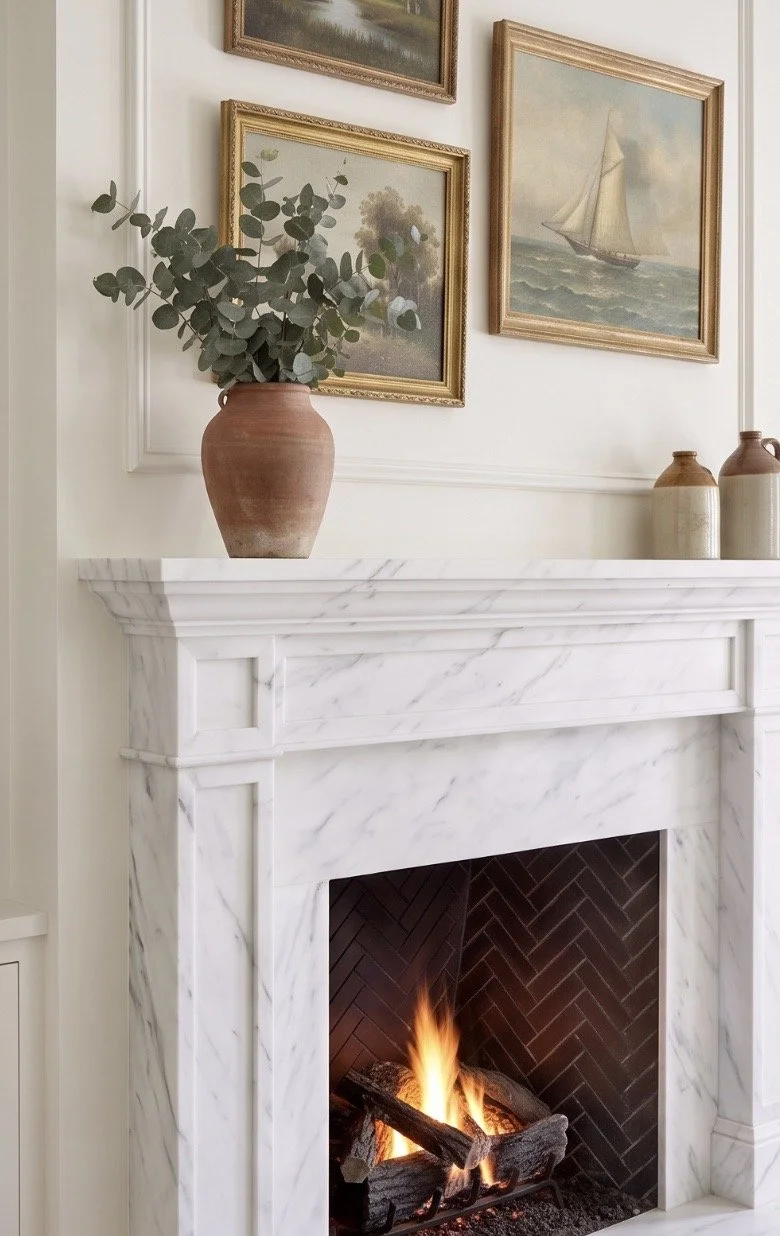
Built-ins usually look better when you leave some of them empty.
Styling shelves can get out of hand surprisingly quickly.
You start with a few books, add a vase, find a basket, decide one shelf looks empty, add something else…and suddenly every square inch has an object sitting on it.
I like leaving some breathing room.
Stack a few books horizontally, stand others vertically, layer one object slightly in front of another, and then give yourself permission to stop.
Mixing materials helps too. Pottery, woven baskets, books, artwork, and a little greenery feel much more natural together than repeating the same kind of accessory over and over.
I’ve linked:
The baskets are especially useful on lower shelves because they aren't just there to look pretty. They can hide cords, games, toys, extra blankets, or any of the less attractive things that still need somewhere to live.
For artwork, I love bringing in something that feels a little older.
I’ve linked a Vintage Gold-Framed Landscape Print here to recreate the look.
Vintage-inspired landscapes are such an easy way to give a newer room some history, and you definitely don't have to spend a fortune on original art to get that feeling.
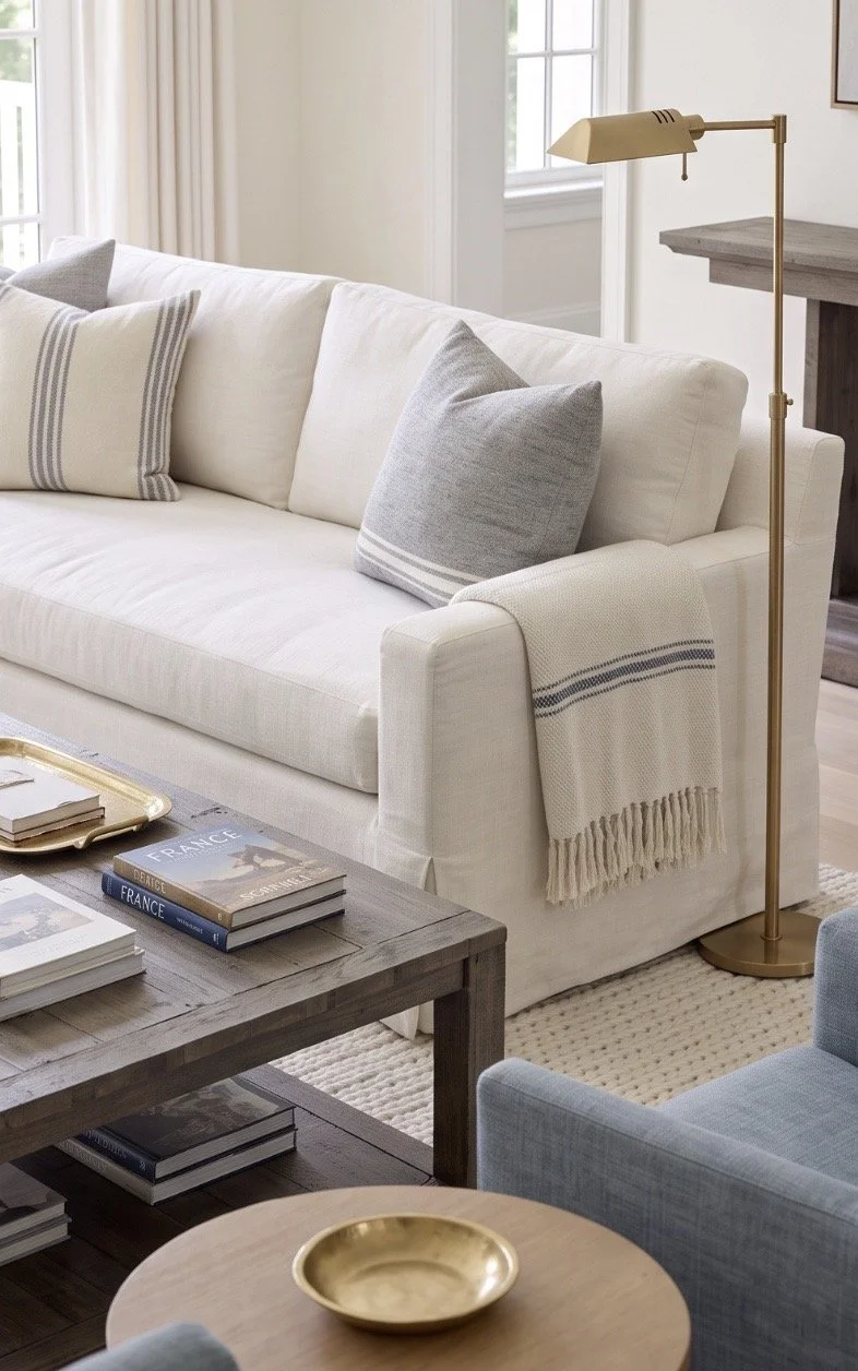
A collected room doesn't need a lot of pattern to feel interesting.
There’s already quite a bit happening here—you just notice it through texture rather than print.
Different woods, woven baskets, pottery, linen, brass, and upholstery give the room plenty of layers before you ever add a patterned fabric.
The lighting continues that mix.
I’ve linked a similar pick for:
I love having more than one source of light in a living room. The chandelier handles the overall lighting, while the floor lamp creates a much softer place to read or sit in the evening.
At the windows, I’d keep things simple. I’ve linked similar TWOPAGES Liz Linen-Look Curtain Panels here.
They’re still one of my favorite ways to get that full, tailored drapery look without going the completely custom route. Hung high and wide, they frame the windows without covering up all that natural light.
Then the striped pillows bring in the room’s one noticeable pattern. I’ve linked similar Navy Striped Pillow Covers here.
And I think one pattern is plenty.
With this many wood tones and natural textures already working together, adding florals, checks, stripes, and everything else would start to take away from what makes the room feel so easy in the first place.
That’s really what I like about this space.
Nothing matches perfectly. Nothing looks like it was bought all at once. But the colors, materials, and finishes relate to one another just enough that it all belongs together.
Which is usually much more interesting than matching anyway.
Love classic home design?
Get one beautifully designed newsletter each month featuring:
New virtual room designs
Designer styling tips
Curated collections
Exclusive decorating inspiration