Light, Space & Linen
Images in this post are AI-generated virtual design concepts created for inspiration. Linked products reflect the style and feel of the pieces shown and are not exact matches.
This post contains affiliate links. As an Amazon Associate, I may earn from qualifying purchases at no additional cost to you.
There’s just something about a bright, airy main living space that never gets old.
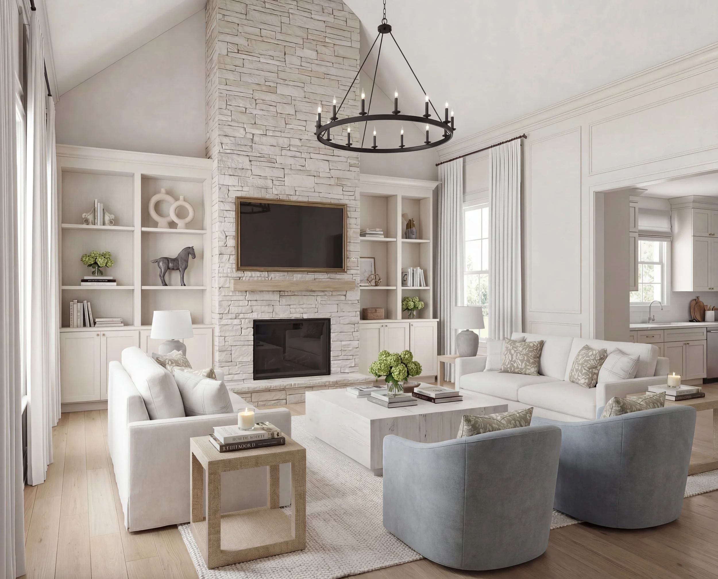
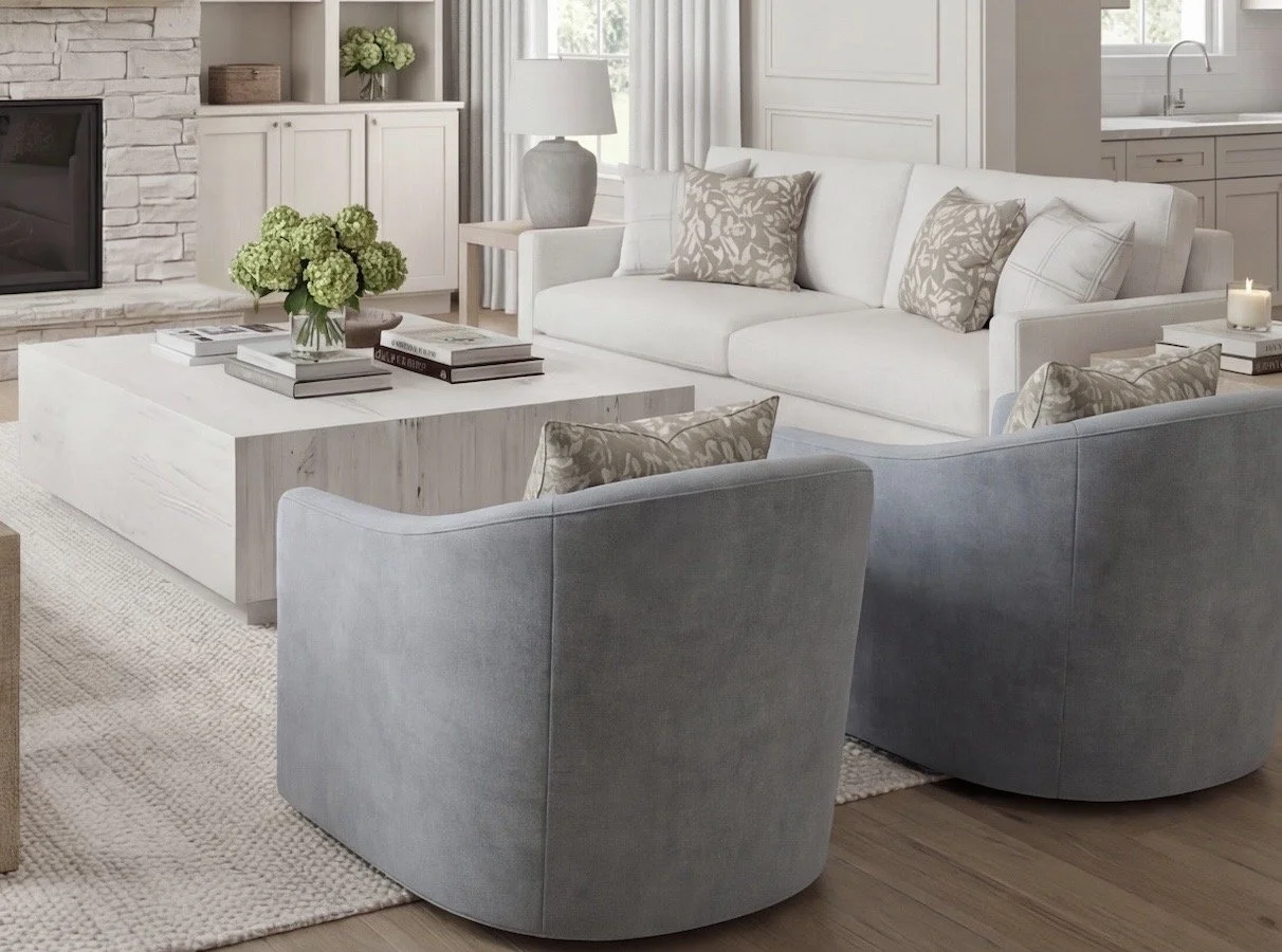
This design concept captures the kind of room that feels calm the second you walk in — light pouring in, layered neutrals, nothing competing for attention. It’s open, relaxed, and quietly pulled together. Exactly how I like a main space to feel.

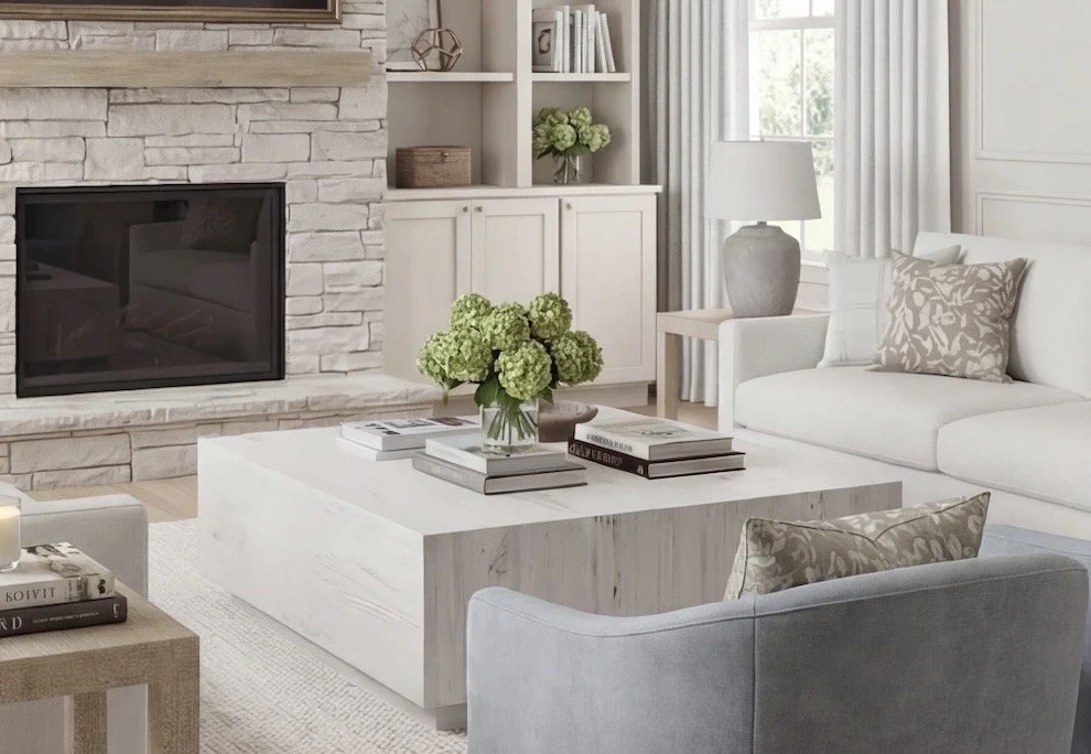
For this look, I started with the foundation: neutral base pieces that set the tone for everything else. A soft, textured area rug anchors the room without overpowering it. I’ve linked a similar neutral option from Amazon that brings that same grounded, understated feel. It’s subtle, but it makes the entire space feel cohesive.
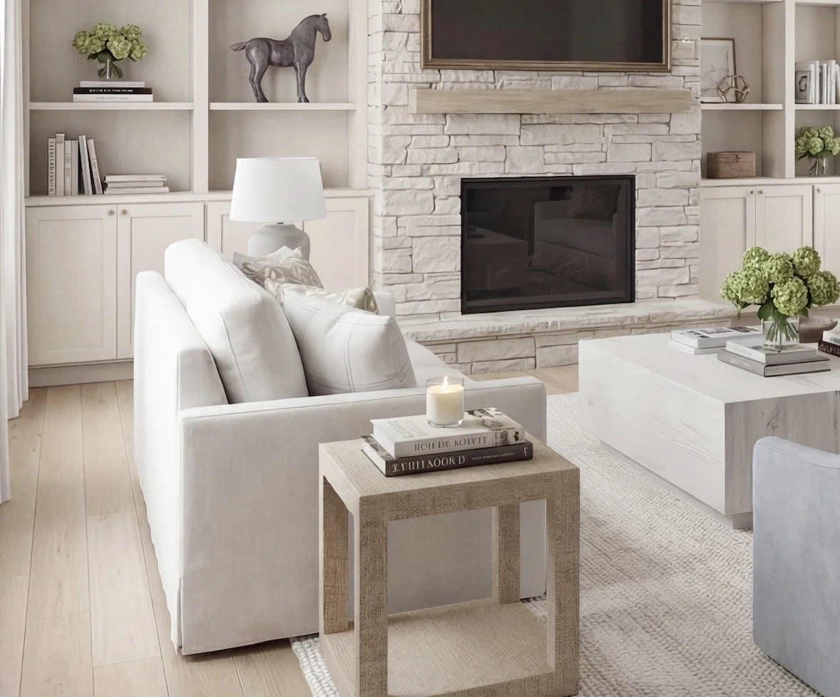
Bright white pinch pleat drapes frame the windows in the cleanest way possible. I’ve linked a comparable set (Two Pages via Amazon) that achieves this look beautifully. I always hang drapes high and wide whenever possible — it visually lifts the ceiling and makes a room feel more finished and intentional.
From there, I kept the larger upholstered pieces neutral. The sofas in this concept are styled as a 2-over-2 cushion configuration, which I specifically love because it feels more modern and tailored than a traditional three-cushion layout. It’s a small detail, but it shifts the look entirely. I’ve sourced a similar silhouette from Birch Lane that reflects this clean-lined feel.

To keep the space from feeling flat, I layered in blue/grey accent chairs. The pair I linked from Wayfair offer a similar tone and balance — just enough color to create contrast while keeping the overall palette neutral and open. Texture plays a big role here too. The raffia-inspired side tables I’ve linked add dimension without overwhelming the room.
The coffee table in this design is simple and substantial — something that feels intentional rather than squeezed in as an afterthought. I’ve linked a light wood square option from Wayfair that captures that same sense of scale and presence.

And now we need to talk pillows.
This is where I almost always save. The pillow covers I’ve sourced are affordable Amazon finds that echo the layered look shown here. Paired with my favorite down-alternative inserts (always size up — 22x22 inserts for 20x20 covers), you get that full, custom feel without the custom price tag. It’s one of my favorite ways to elevate a space without overspending.
Styling built-ins is honestly one of my favorite design exercises. I like anchoring upper shelves with larger-scale art pieces and layering downward with books, sculptural objects, and greenery. The decor pieces I’ve linked offer a similar collected, balanced look if you’re recreating this style at home.
Finally, the chandelier brings structure overhead. I’ve linked a 16-light wagon wheel option from Wayfair that mirrors the traditional silhouette used in this concept. A well-chosen light fixture can completely shift the tone of a room — this style adds presence without feeling heavy.

This design is meant to feel livable — neutral, layered, welcoming. Bright, but not stark. Styled, but not fussy. The kind of space you actually want to sit down in and stay awhile.
Shop This Look
Below are pieces that capture the overall style and feel of this design. Every piece below was selected to work together — just like a full-service design plan, without the designer price tag.
Furniture
Lighting & Textiles
You May Also Like…