Where Blue Meets Cream
Images in this post are AI-generated virtual design concepts created for inspiration. Linked products reflect the style and feel of the pieces shown and are not exact matches.
This post contains affiliate links. As an Amazon Associate, I may earn from qualifying purchases at no additional cost to you.

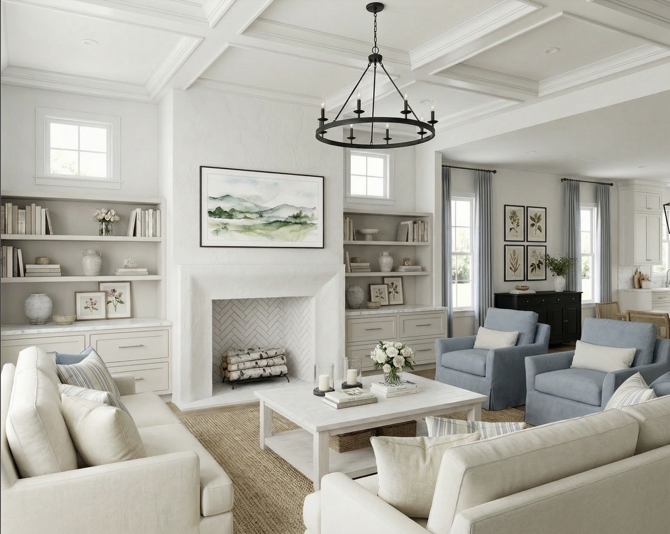
There’s something timeless about a layered neutral room with just a whisper of color. This design leans into creamy upholstery, soft blue accents, and natural texture to create a space that feels collected, calm, and elevated without trying too hard.
The Foundation: Classic Cream Sofas
This room begins with tailored, cream-upholstered sofas similar the ones I linked from Birch Lane. A neutral base like this creates flexibility and longevity — it allows accent pieces to evolve over time without needing to replace your largest investments.
Look for:
Warm ivory or soft cream performance fabric
Structured cushions in a 2-over-2 setup
Clean, traditional lines
A sofa like this becomes the quiet anchor of the entire room.
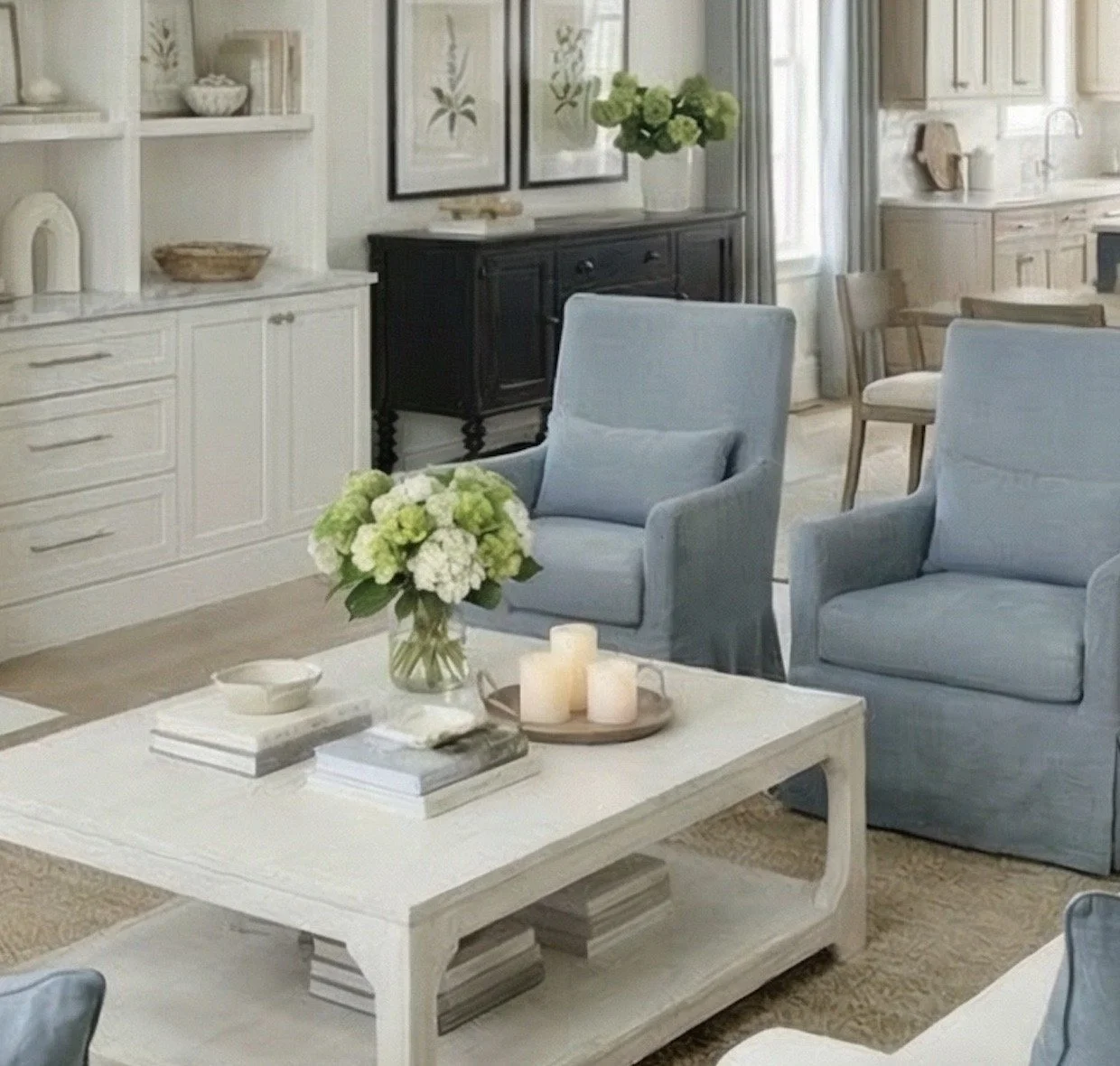
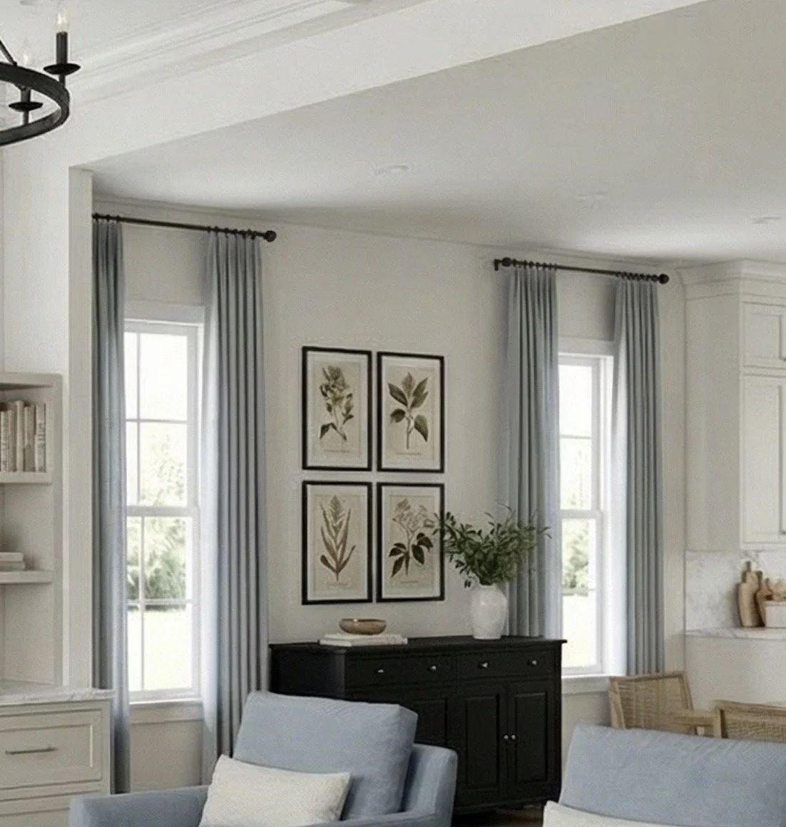
Soft Blue Accent Chairs
The muted blue accent chairs bring gentle contrast while keeping the palette cohesive. Instead of bold navy or coastal tones, this softer blue feels refined and subtle. The ones I’ve linked are a great find from Birch Lane.
Using color in accent seating adds personality without overwhelming the space.
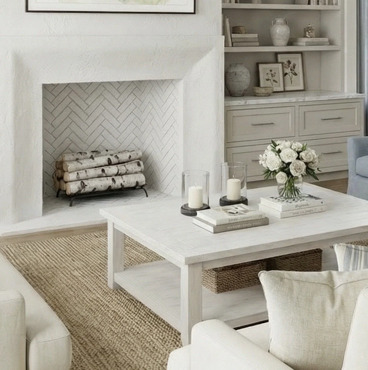
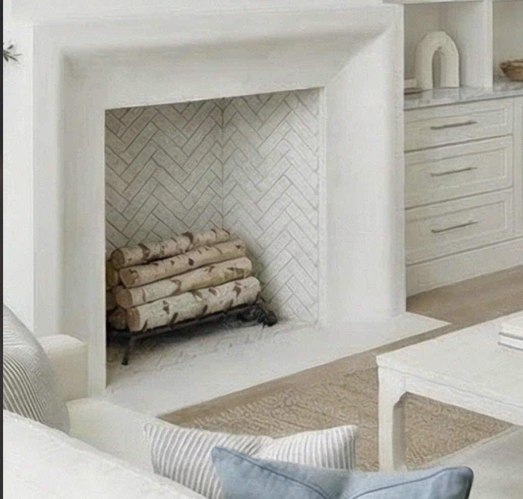
Grounding with Natural Texture
To keep lighter upholstery from feeling flat, texture does the heavy lifting here.
A woven jute-style rug (similar option linked from Amazon) adds warmth and visual weight. Natural fiber rugs are one of my favorite foundational layers — they support the room without competing for attention.
Ceramic vases, stacked books, and layered decor on the shelves continue that tonal, textured approach. I’ve linked some of my favorite shelf decor from Amazon below.
The Coffee Table Moment
The coffee table shown here reflects classic lines and a light finish- I’ve linked a similar one from Serena & Lily- it’s a splurge but ties the room together beautifully.
For styling, I always come back to a simple formula:
Stacked books for structure
A candle for warmth
Fresh or real-touch faux florals for softness
It’s effortless but always polished.
Statement Lighting
The iron ring chandelier (similar to the one I’ve linked from Amazon) introduces contrast against the soft palette. Darker metal finishes help anchor bright spaces and add architectural interest..

Why This Design Works
This room works because it stays disciplined:
A tight color palette (cream, soft blue, natural wood, black metal)
Classic silhouettes
Layered texture over heavy pattern
Elevated but accessible sourcing
Nothing feels overly trendy — which is exactly why it feels timeless.

Shop The Look
Below are pieces that capture the overall style and feel of this design. Linked products reflect the style and feel of the pieces shown and are not exact matches. Every piece below was selected to work together — just like a full-service design plan, without the designer price tag.
Furniture
Lighting & Textiles
Decor
You May Also Like…